It’s something many of us have been curious about. So we decided to explore it through a small initiative we’re calling BrandSync Labs.
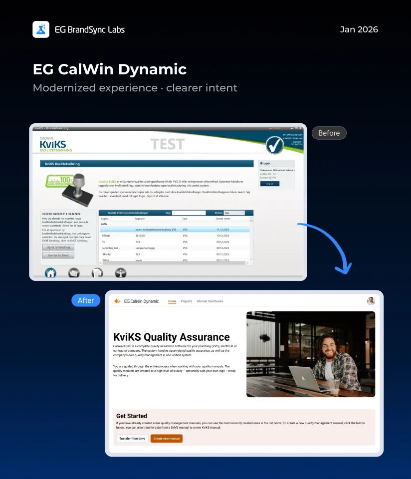
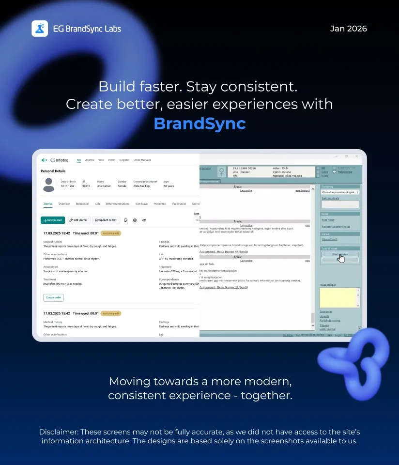
We reached out to a few BUs and worked with screenshots from their existing products. To explore further, we also used screenshots from products featured on our company website.
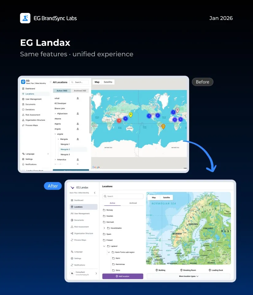
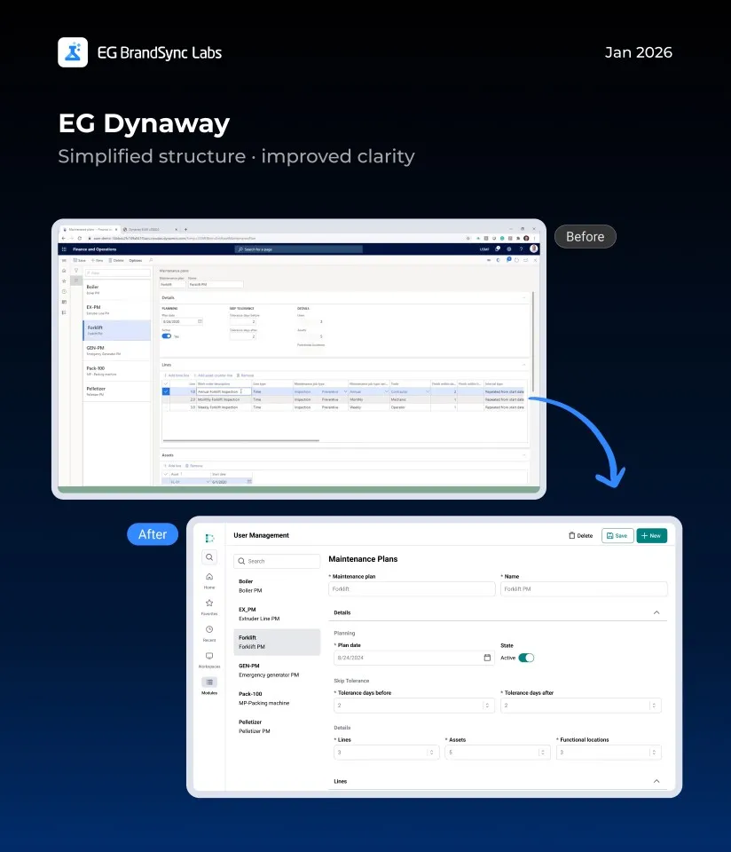
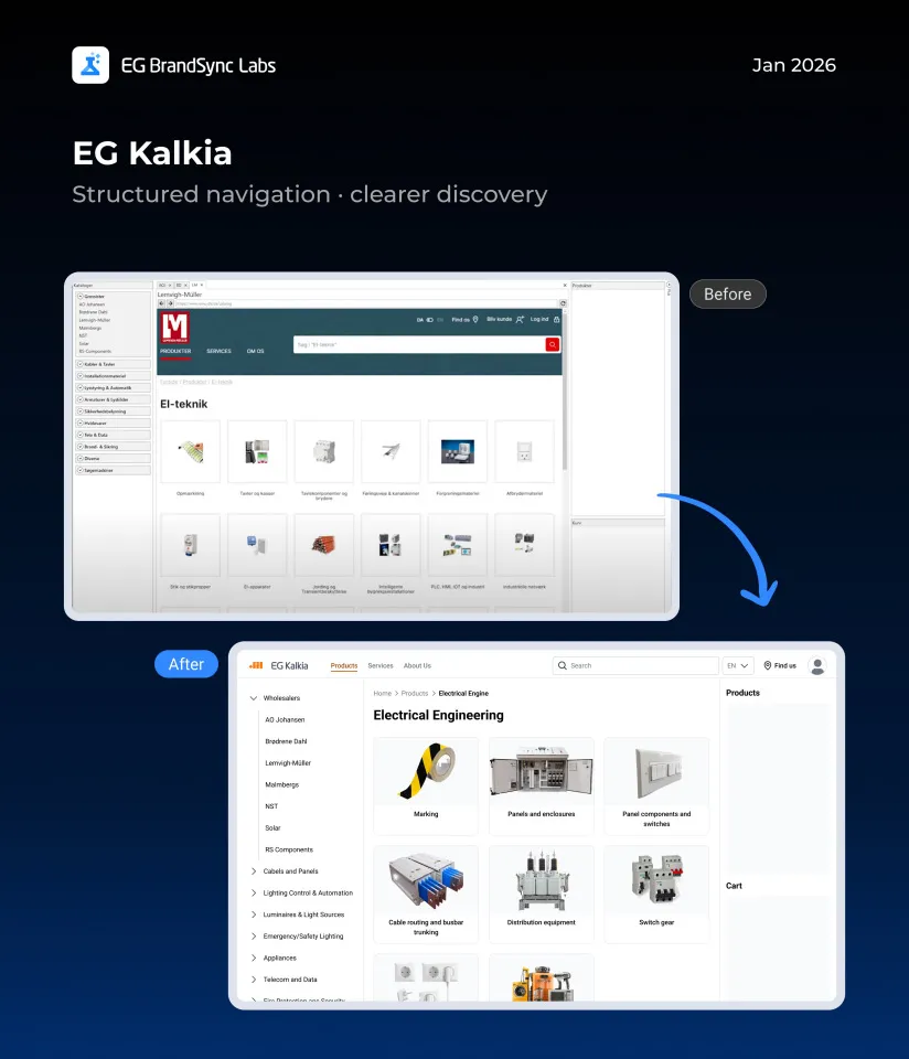
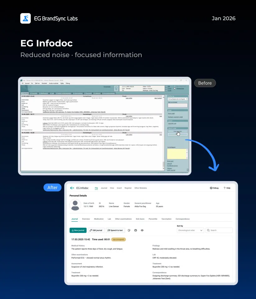
A quick note before we dive in: we know our products are built in very different ways, across structures, technologies, languages, and plenty of real-world constraints. These screens aren’t meant to be perfect or final. Instead, they’re meant to give a feel for how our products could look with a clearly defined design system, and how a more consistent EG experience might come together across products.
Using only the information available in the screenshots, we recreated these screens with the BrandSync design system. Without changing core features or major flows, we saw how simply applying shared components and guidelines alone can make products feel more consistent, modern, and easier to use.
Think of this as a conversation starter and a visual reference, not a prescription. We hope it sparks ideas and makes it easier to imagine how BrandSync can support the great work already happening across teams.
We’ve linked the BrandSync Labs file so you can dive into all the example screens yourself.
https://www.figma.com/design/BVx1NVAwtOM5lBRGH3Q5uP/Brandsync-Labs?node-id=0-1&t=VaeMCLPy0TUrnDI4-1
Curious about the building blocks? The BrandSync UI Kit is also linked so you can view all the components.
Happy designing!

Leave a Reply