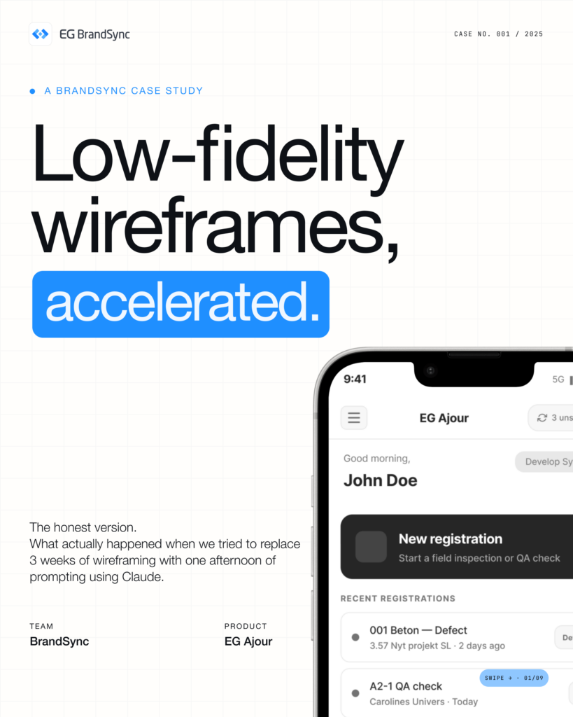
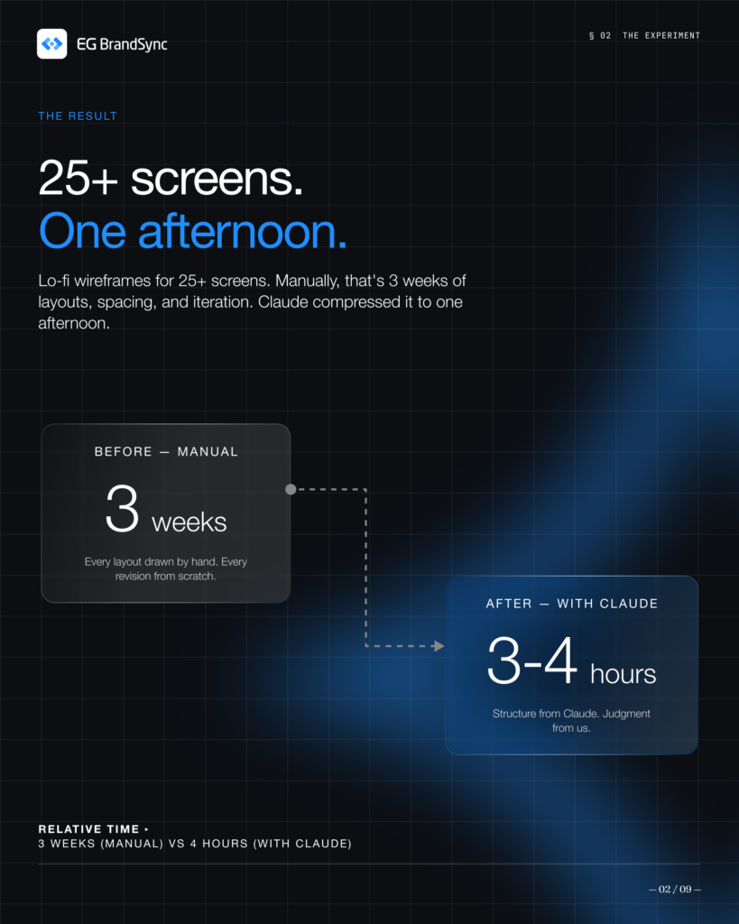
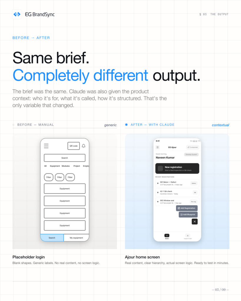
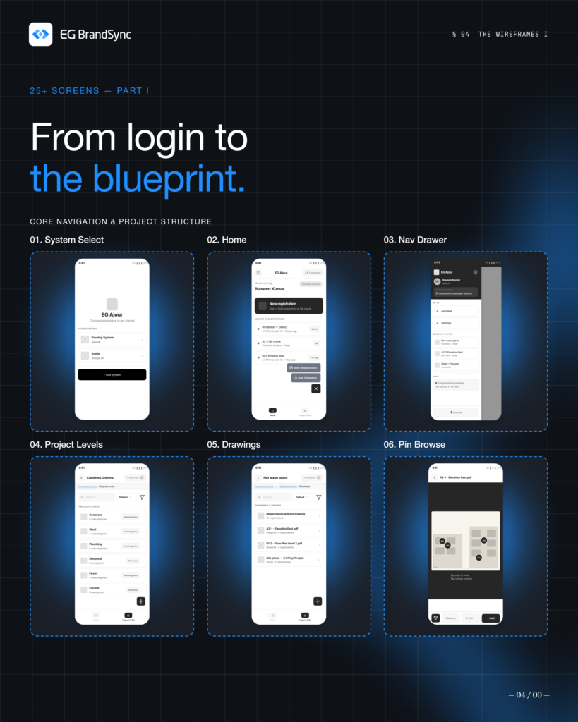
In a single afternoon, we generated 25+ lo-fi wireframes, something that would usually take weeks. This deck breaks down exactly how we did it.
Here, you’ll find:
Our 6-step method
Real wireframes
What worked and what didn’t
The outcomes we achieved
Claude sped up layout generation, but the thinking and decisions stayed with our team. It didn’t replace our process, it helped us move through it faster and more efficiently.
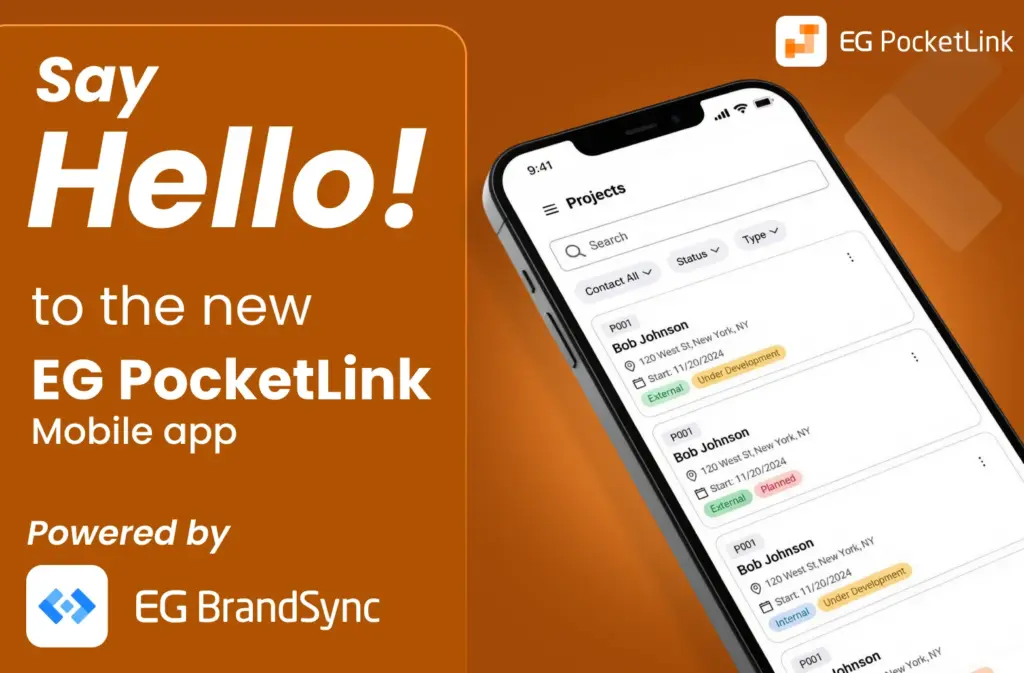
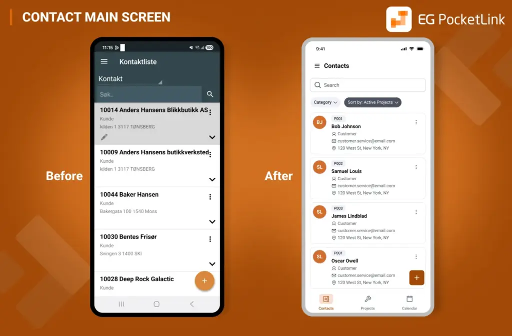
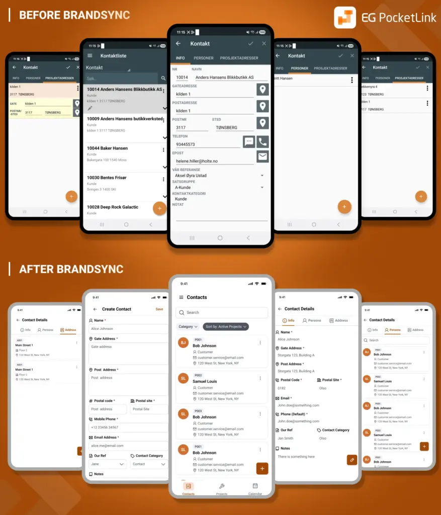
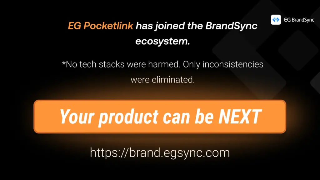
EG PocketLink has officially joined the BrandSync ecosystem, adopting EG’s unified design foundations while keeping the existing tech stack and framework fully intact. No rebuild. No disruption. Just the power of the right foundations. And the difference is immediately visible.
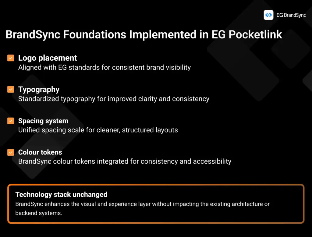
What was implemented through BrandSync:
Logo placement Now aligned with EG standards for consistent and confident brand presence
Typography Standardized typography for improved clarity and readability
Spacing system A unified spacing scale creating cleaner, more structured layouts
Colour tokens BrandSync colour tokens integrated for consistency, accessibility, and scalability
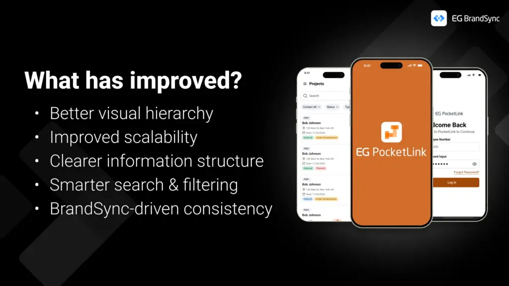
• Stronger visual hierarchy • Clearer information structure • Improved scalability for future growth • Smarter, more intuitive search and filtering • A consistent, unmistakable EG experience
This is a great example of how implementing the right foundations can transform a product experience without changing the underlying technology.
A huge shout-out to the EG PockelLink team for their fantastic collaboration and openness throughout this process. It’s been a pleasure working together, and the results truly speak for themselves.
Welcome to the BrandSync ecosystem, EG PocketLink. 🙂
It’s something many of us have been curious about. So we decided to explore it through a small initiative we’re calling BrandSync Labs.
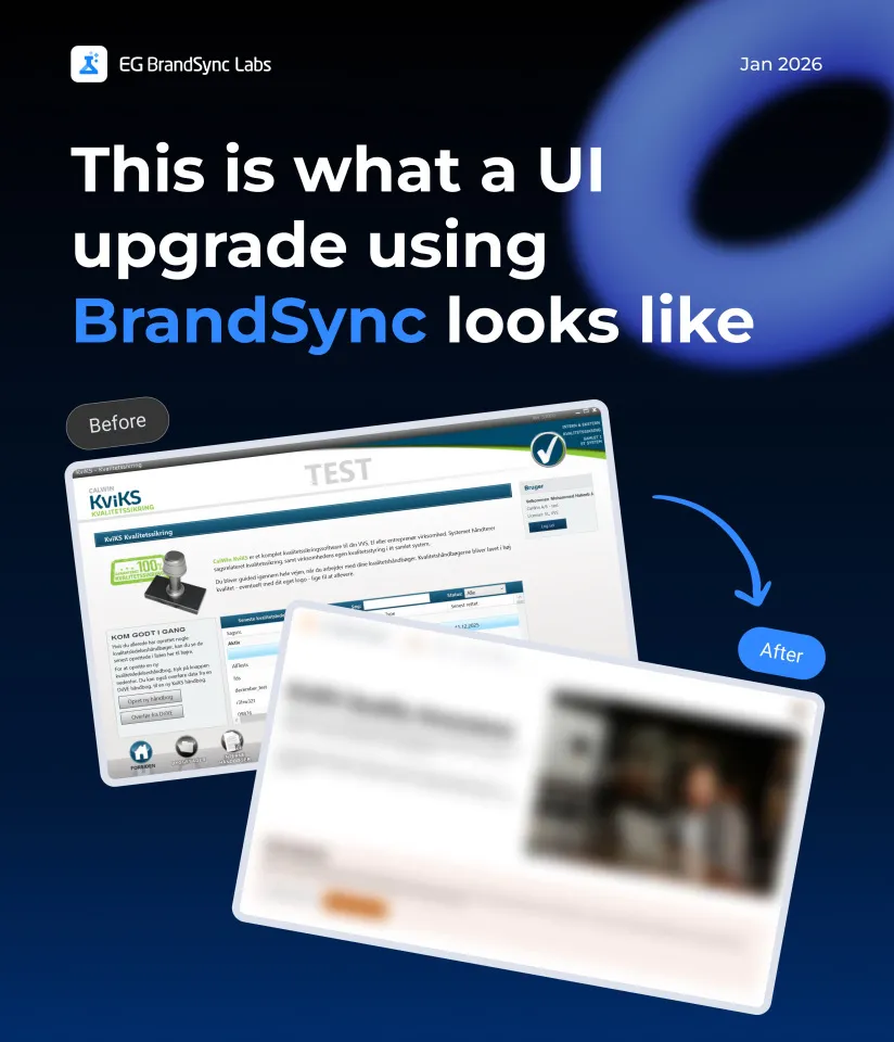
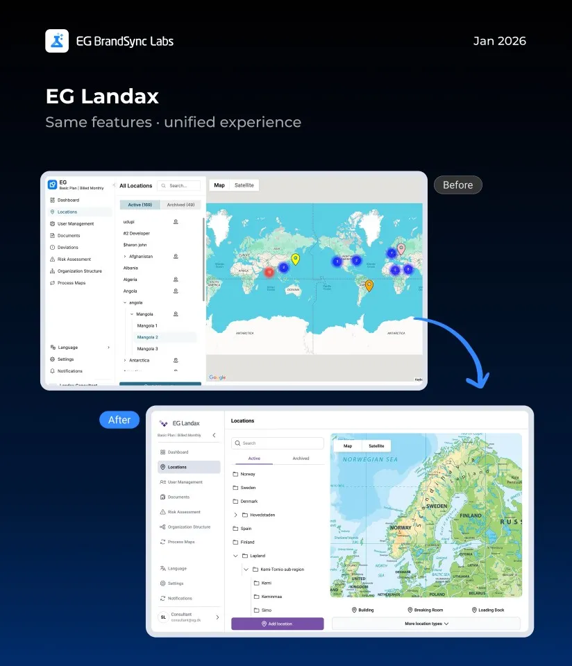
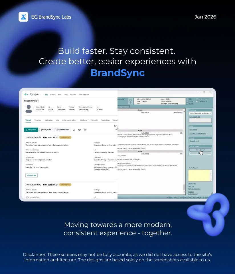
We reached out to a few BUs and worked with screenshots from their existing products. To explore further, we also used screenshots from products featured on our company website.
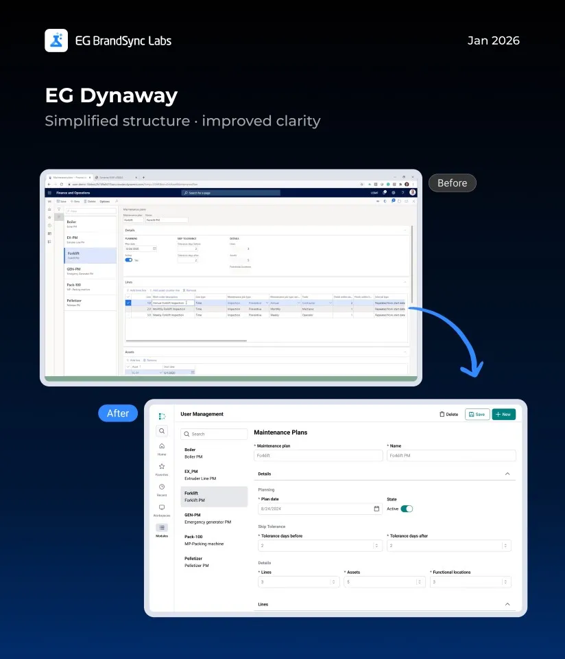
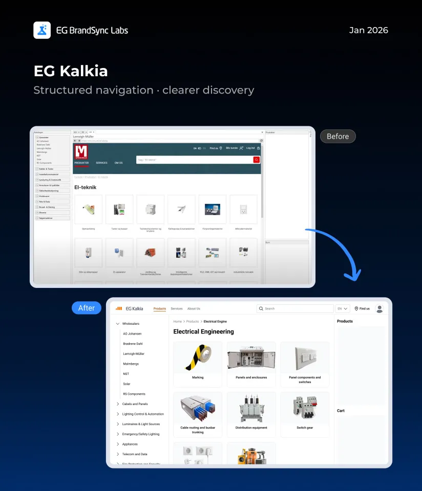
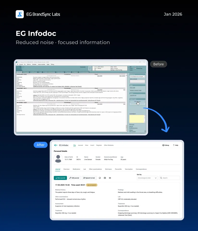
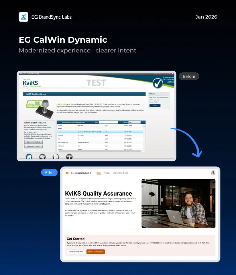
A quick note before we dive in: we know our products are built in very different ways, across structures, technologies, languages, and plenty of real-world constraints. These screens aren’t meant to be perfect or final. Instead, they’re meant to give a feel for how our products could look with a clearly defined design system, and how a more consistent EG experience might come together across products.
Using only the information available in the screenshots, we recreated these screens with the BrandSync design system. Without changing core features or major flows, we saw how simply applying shared components and guidelines alone can make products feel more consistent, modern, and easier to use.
Think of this as a conversation starter and a visual reference, not a prescription. We hope it sparks ideas and makes it easier to imagine how BrandSync can support the great work already happening across teams.
We’ve linked the BrandSync Labs file so you can dive into all the example screens yourself.