Author: Mehnaz Z

  • BrandSync Utilities is here!

    BrandSync Utilities is here!


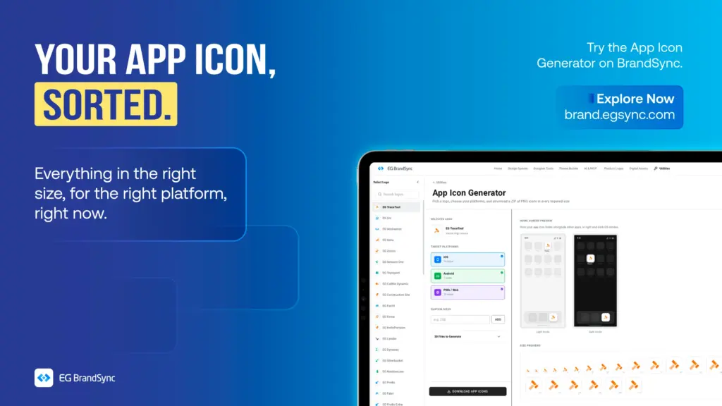
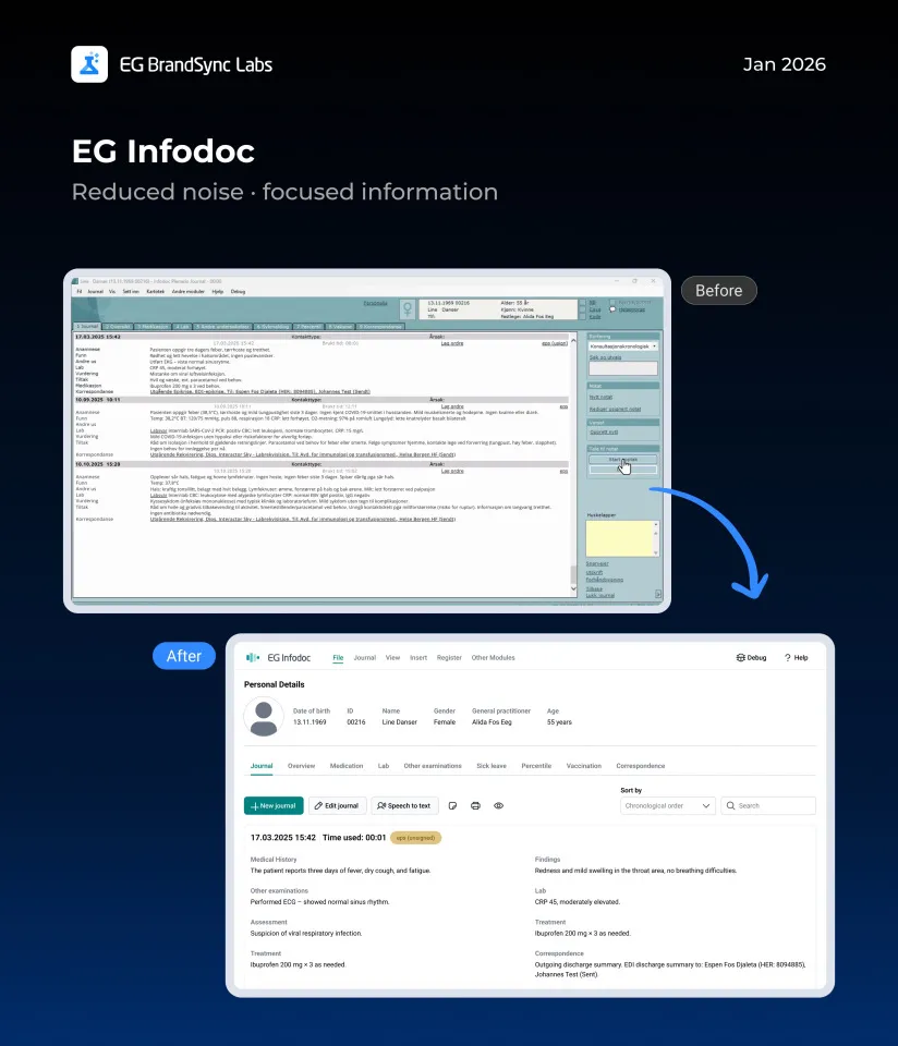
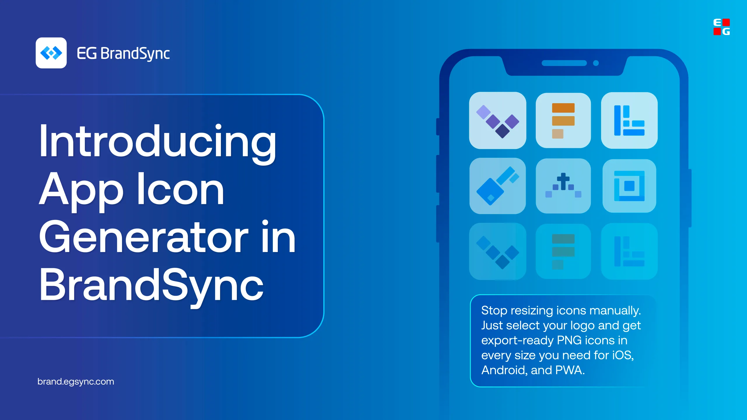
    Starting with the App Icon Generator

    Turn your product logo into every app icon size you need, INSTANTLY!!!! 🙂

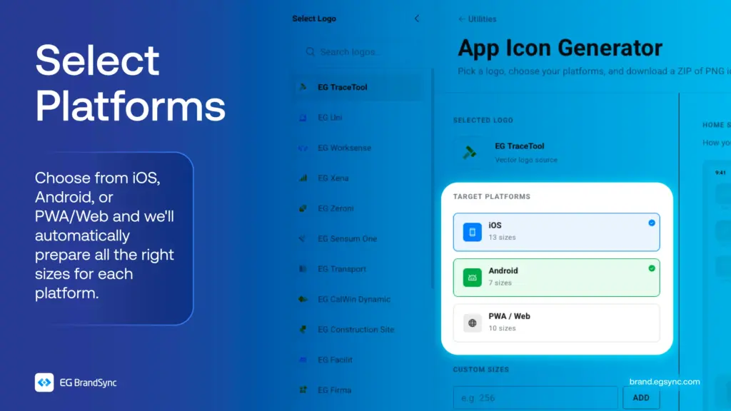
    Creating app icons for different platforms can take time.

    The BrandSync App Icon Generator makes it simple.

    Just select your product logo, choose your Device platform, and get all the required icon sizes automatically. No need to resize anything manually.

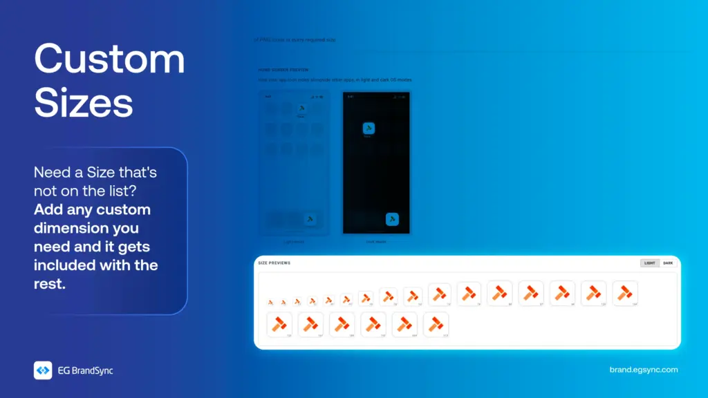
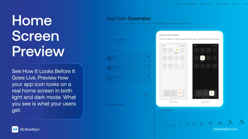
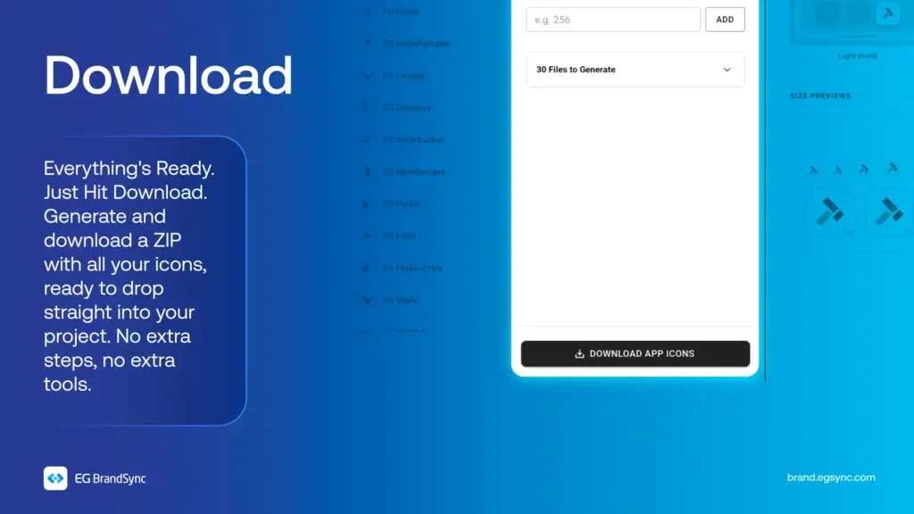
    You can also add custom sizes, preview how your icon looks on a mock phone screen, and download everything in one go.

    All your app icons, ready to use.

    Try the App Icon Generator on BrandSync: https://brand.egsync.com/utilities/app-icons

    Other utilities:

    Favicon Generator

    Generate a single .ico file with multiple sizes embedded, perfect for favicons and Windows app icons.

    Colour converter

    Convert between HEX, RGB, HSL, and CMYK. Edit any format and all others update instantly. Use HEX and RGB for web and digital, HSL for UI theming, and CMYK for print production.

    #AppIconGenerator #BrandSync #DesignTools #BrandSyncUtilities #UXDesign

  • Colour does more than make things look good.

    Colour does more than make things look good.

    It guides attention. It communicates meaning. It shapes how users understand and interact with a product.

    But when colour isn’t accessible, it creates confusion instead of clarity.

    Some users may not distinguish between certain colours. Some may struggle with low contrast. Some may miss critical information entirely.

    That’s why accessible colour isn’t a design choice. It’s a design responsibility.

    In BrandSync, colour palettes are built with WCAG 2.1 AA standards at the core. Every combination is tested for contrast, clarity, and usability across components and environments.

    From structured colour roles to consistent visual hierarchy, every colour serves a purpose, not just aesthetically but functionally.

    Because when colour works for everyone, design becomes clearer, stronger, and more inclusive.

    Explore how BrandSync builds accessible color palettes:

    Accessible Colour Palettes

    Other helpful resources

    https://brand.egsync.com/design-system/accessibility

    #Accessibility #InclusiveDesign #DesignSystems #WCAG #BrandSync #UXDesign

  • Not everyone experiences digital products in the same way.

    Not everyone experiences digital products in the same way.

    1. Some people see everything clearly.
    2. Some rely on sound.
    3. Some navigate entirely with a keyboard.
    4. Some depend on assistive technologies to interact with interfaces.

    Accessibility isn’t something you add later in the process. It’s something you build into the foundation from the very beginning.

    In BrandSync, every component is designed with the POUR framework in mind. Perceivable. Operable. Understandable. Robust.

    Following WCAG 2.1 AA standards, accessibility is considered in every colour choice, every component, and every interaction that is designed.

    Because inclusive design isn’t just about meeting standards. It’s about creating experiences that genuinely work for everyone.

    Visit https://brand.egsync.com/design-system/accessibility to explore how accessibility is integrated into components and how it helps teams build inclusive products.

    Other helpful resources

    Accessible Colour Palettes

    #Accessibility #InclusiveDesign #DesignSystems #WCAG #BrandSync #UXDesign

  • Introducing EG Product Logos – Figma Plugin

    Introducing EG Product Logos – Figma Plugin

    This new tool creates a direct, searchable connection to the BrandSync asset library inside your Figma workspace, giving you instant access to official and always up-to-date product logos.

    No more outdated files. No more searching through folders. Just search and place.

    Key Features

    Direct BrandSync Integration

    Instantly search and fetch the latest approved product logos without leaving Figma. The plugin connects directly to the official BrandSync source of truth.

    Scalable Vector Quality All logos are delivered in SVG format and can be scaled to any size while maintaining perfect clarity and sharpness.

    Smart Format Selection

    When multiple logo variations exist such as Horizontal, Vertical, Dark, or Negative, the plugin allows you to preview and select the exact format required for your layout. This ensures correct usage every time.

    How to Get Started

    1. Install the Plugin first – EG Product Logos
    2. Right-click on your canvas
    3. Select Plugins
    4. Under Select from EG A/S -> Select Product Logos

    This release is another step toward a unified EG brand ecosystem, making it easier for teams to stay consistent.

    We look forward to your feedback and feature requests in the thread below.

    Other BrandSync FIgma Plugins: Link to other BrandSync Plugins

  • The New EG Image bank is here.

    The New EG Image bank is here.

    One place to download all stock images owned by EG.
    We have launched our new shared image bank 🚀

    We are very excited to share that our new company-wide image bank is now live.

    It is not fully updated yet, but it is ready to serve. 🫡

    What is it?

    The image bank is a central place where you can find photos for presentations and other materials.

    All images are free to use, brand approved, and represent our different industries.

    We will still keep Templafy, where you can also find approved images. The difference is that this image bank will contain many more photos and give us a stronger overview.

    And yes, it is powered by AI.

    We use AI to help describe and tag the images. That means less manual work for us and much easier search when you are looking for something specific.

    Why are we doing this?

    Accessibility.

    Brand consistency.

    We are strengthening EG as one brand across platforms and business units. The more consistent we are visually, the stronger and more recognizable we become in the market.

    This project also continues the great collaboration we started during the CVI work. UX, Corporate Communication and Marketing have worked closely together to make this happen.

    A big shout out to Manjeeth Shenoy and the UX team for opening up BrandSync for us, and developing functionality to fit a modern repository. This helps ensure that our brand is consistent across both our products and our external communication.

    Check it out: https://brand.egsync.com/digital-assets/stock-images

  • Introducing EG BrandSync in Figma Make

    Introducing EG BrandSync in Figma Make

    You can now generate structured, on-brand UI screens directly from prompts in Figma Make using EG’s official typography, colors, and components.

    This helps you move from idea to interface much faster while staying fully aligned with BrandSync across products.

    How to Access

    Login to figma

    In Figma Make, select:

    EG BrandSync UI Kit (Please refer to the screenshot.)

    You will need Organisation Figma account (Full dev Seat) to use it.

    What You Can Do with BrandSync in Figma Make

    • Generate on-brand screens in seconds • Automatically use official BrandSync components • Maintain visual consistency across products • Prototype quickly without starting from scratch

    Think of it as your acceleration layer for UI creation.

    Full documentation on how to prompt for the best results is available here: https://brand.egsync.com/figma-kit/figma-make

    What This Is Not

    This is not a replacement for UX strategy, research, or product discovery.

    It is a speed layer that helps teams move faster while staying on-brand.

    We look forward to your feedback.

    Happy prototyping

    – Team BrandSync

    Essential BrandSync Resources

    Quick Start Guide

    New Product Logos

    Accessible Color Palettes

    Theme Builder

    BrandSync Figma Kit

    #engage #engageandamplify

  • Say Hello to the new EG PocketLink Mobile App, Powered by BrandSync.

    Say Hello to the new EG PocketLink Mobile App, Powered by BrandSync.

    EG PocketLink has officially joined the BrandSync ecosystem, adopting EG’s unified design foundations while keeping the existing tech stack and framework fully intact. No rebuild. No disruption. Just the power of the right foundations. And the difference is immediately visible.

    What was implemented through BrandSync:

    1. Logo placement Now aligned with EG standards for consistent and confident brand presence
    2. Typography Standardized typography for improved clarity and readability
    3. Spacing system A unified spacing scale creating cleaner, more structured layouts
    4. Colour tokens BrandSync colour tokens integrated for consistency, accessibility, and scalability

    (Read more on BrandSync Foundations)

    And some nifty UX Fixes 🙂

    What this improves

    • Stronger visual hierarchy • Clearer information structure • Improved scalability for future growth • Smarter, more intuitive search and filtering • A consistent, unmistakable EG experience

    This is a great example of how implementing the right foundations can transform a product experience without changing the underlying technology.

    A huge shout-out to the EG PockelLink team for their fantastic collaboration and openness throughout this process. It’s been a pleasure working together, and the results truly speak for themselves.

    Welcome to the BrandSync ecosystem, EG PocketLink. 🙂

    -Team BrandSync

    https://brand.egsync.com

  • Introducing EG BrandSync Studio

    Introducing EG BrandSync Studio

    Excited to share something we have been working on – EG BrandSync Studio, a Figma plugin that lays the foundations of the EG BrandSync design system in one click.

    Pick a brand color, hit generate, and you get:

    • Colors – 14 brand palettes, neutrals, and semantic tokens with light/dark mode support
    • Typography – Responsive text scales for Desktop, Tablet, and Mobile
    • Elevation – 5 shadow levels from subtle to dramatic
    • Layout Grids – Mobile (4-col), Tablet (8-col), and Desktop (12-col)
    • Components – Starter Button, Input, Card, and Badge components
    • Color Swatches – Visual reference with WCAG contrast ratings

    Everything lands in your Figma style panel

    • Organized and ready to use.
    • Re-run safely – existing styles get skipped.
    • One-click cleanup if you want to start fresh.

    Built this to save time setting up new files and keep things consistent across projects. We would love feedback if you give it a try!

    Link to the Figma Plugin: https://www.figma.com/community/plugin/1602933425766782230

    Link to EG BrandSync: brand.egsync.com

  • EG Product Logos on BrandSync

    We’re excited to introduce new EG Product Logos on BrandSync.

    What’s now available:

    • One place to find approved product logos
    • Downloadable assets in JPG, PNG, SVG, EPS, and JPEG
    • WCAG-compliant colour previews for accessible usage
    • Standardised logo usage across interfaces and materials

    By bringing product logos into one unified system, BrandSync helps teams save time, avoid inconsistencies, and maintain a cohesive and professional product identity across EG.

    Your logos are now easier to find. Easier to use. And always up to date.

    Explore Product Logos on BrandSync:

    Logos | EG Brandsync

    Logo Placement Guidelines:

    Logo Placement Guidelines | Navigation Header Guidelines

    We’re continuously adding more logos as we get access to them. If you don’t see your product logo yet, no worries, it’s on the way.

    Happy exploring!

    – EG BrandSync Team

  • What happens when EG products meet BrandSync?


    It’s something many of us have been curious about. So we decided to explore it through a small initiative we’re calling BrandSync Labs.

    We reached out to a few BUs and worked with screenshots from their existing products. To explore further, we also used screenshots from products featured on our company website.

    A quick note before we dive in: we know our products are built in very different ways, across structures, technologies, languages, and plenty of real-world constraints. These screens aren’t meant to be perfect or final. Instead, they’re meant to give a feel for how our products could look with a clearly defined design system, and how a more consistent EG experience might come together across products.

    Using only the information available in the screenshots, we recreated these screens with the BrandSync design system. Without changing core features or major flows, we saw how simply applying shared components and guidelines alone can make products feel more consistent, modern, and easier to use.

    Think of this as a conversation starter and a visual reference, not a prescription. We hope it sparks ideas and makes it easier to imagine how BrandSync can support the great work already happening across teams.

    We’ve linked the BrandSync Labs file so you can dive into all the example screens yourself.

    https://www.figma.com/design/BVx1NVAwtOM5lBRGH3Q5uP/Brandsync-Labs?node-id=0-1&t=VaeMCLPy0TUrnDI4-1

    Curious about the building blocks? The BrandSync UI Kit is also linked so you can view all the components.

    https://www.figma.com/design/zF98rGtaPpBjSc2PpPK5vo/EG-Brand-Sync-UI-Kit—v1.0?m=auto&node-id=10203-41611&t=27hsfRwTevmQwSl7-1

    Happy designing!