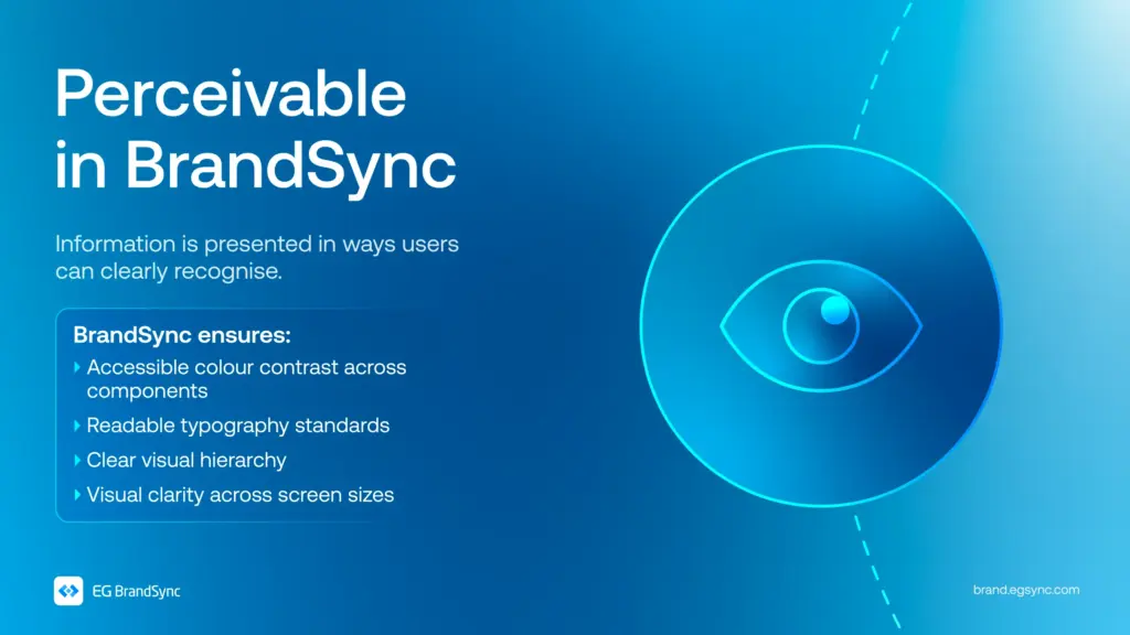
Not everyone experiences digital products in the same way.
- Some people see everything clearly.
- Some rely on sound.
- Some navigate entirely with a keyboard.
- Some depend on assistive technologies to interact with interfaces.
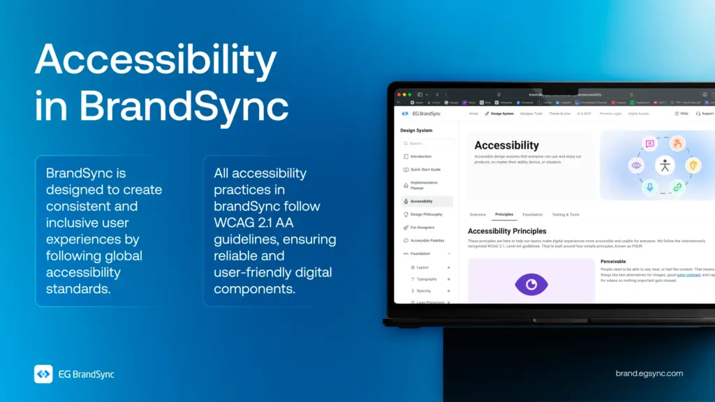
Accessibility isn’t something you add later in the process. It’s something you build into the foundation from the very beginning.
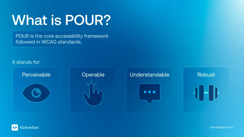
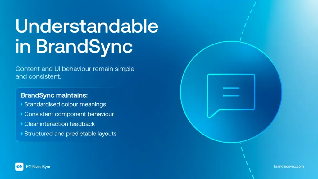
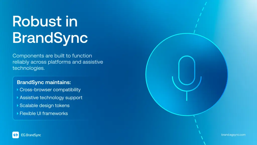
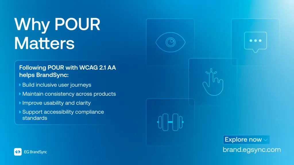
In BrandSync, every component is designed with the POUR framework in mind. Perceivable. Operable. Understandable. Robust.
Following WCAG 2.1 AA standards, accessibility is considered in every colour choice, every component, and every interaction that is designed.
Because inclusive design isn’t just about meeting standards. It’s about creating experiences that genuinely work for everyone.
Visit https://brand.egsync.com/design-system/accessibility to explore how accessibility is integrated into components and how it helps teams build inclusive products.
Other helpful resources
#Accessibility #InclusiveDesign #DesignSystems #WCAG #BrandSync #UXDesign

Leave a Reply