It guides attention. It communicates meaning. It shapes how users understand and interact with a product.
But when colour isn’t accessible, it creates confusion instead of clarity.
Some users may not distinguish between certain colours. Some may struggle with low contrast. Some may miss critical information entirely.
That’s why accessible colour isn’t a design choice. It’s a design responsibility.
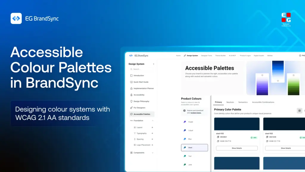
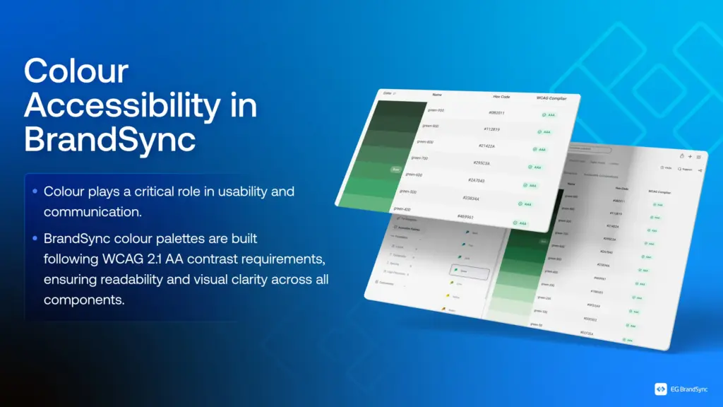
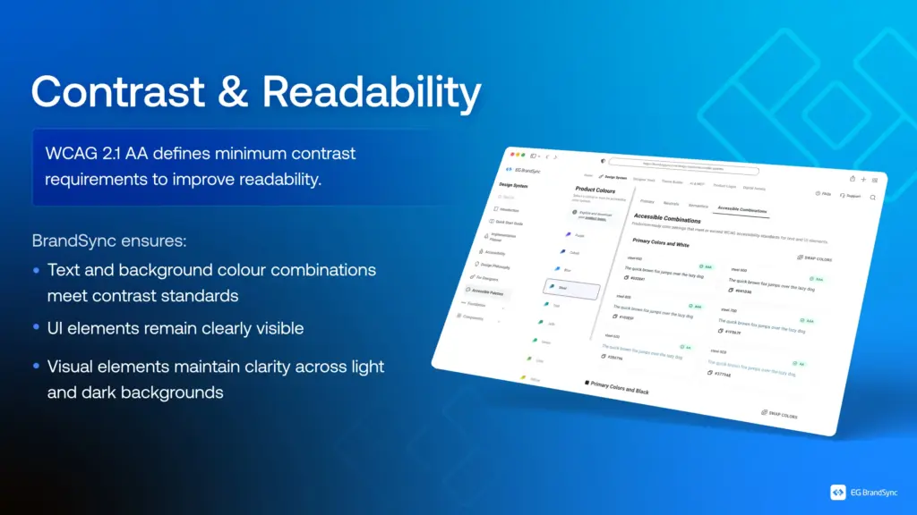
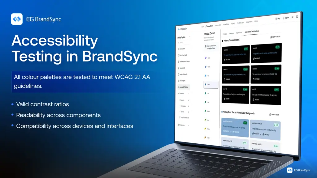
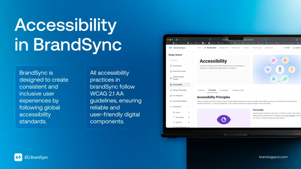
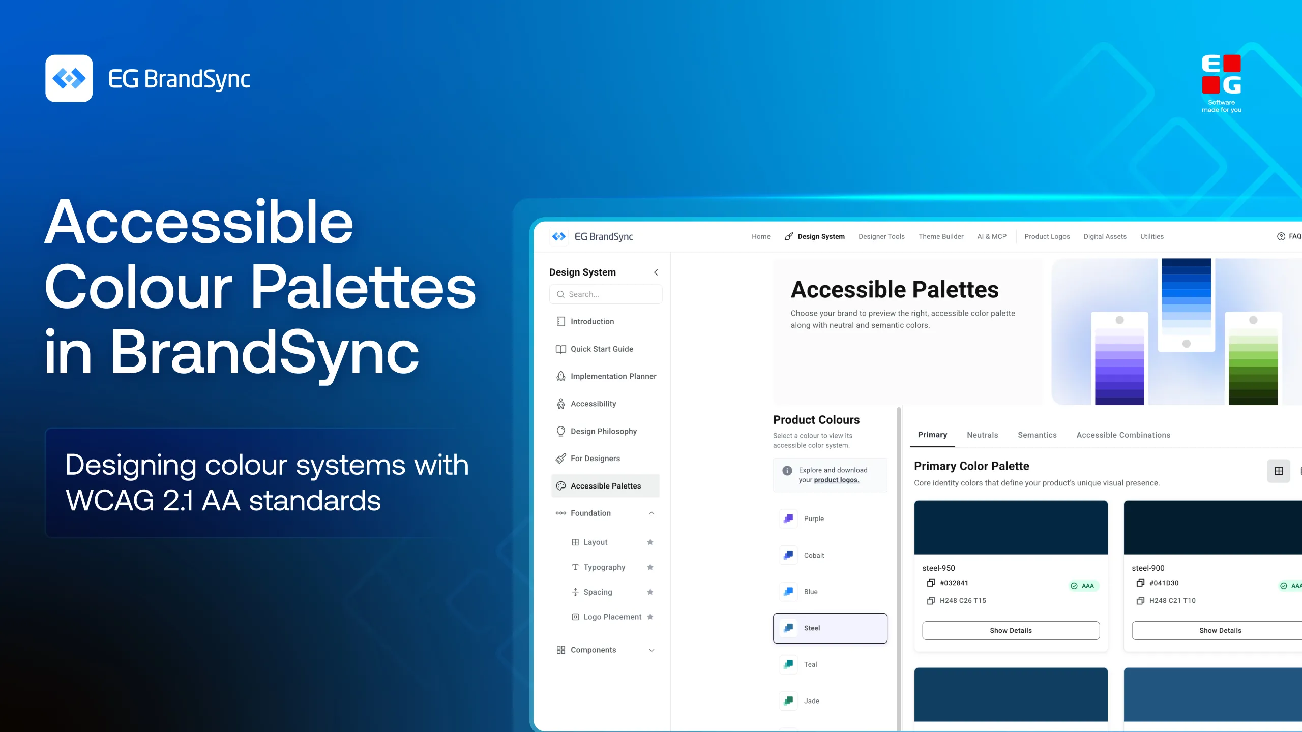
In BrandSync, colour palettes are built with WCAG 2.1 AA standards at the core. Every combination is tested for contrast, clarity, and usability across components and environments.
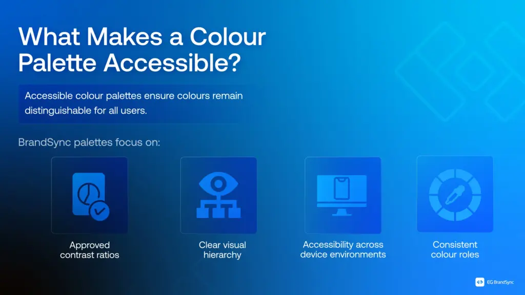
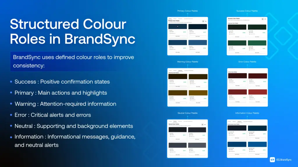
From structured colour roles to consistent visual hierarchy, every colour serves a purpose, not just aesthetically but functionally.
Because when colour works for everyone, design becomes clearer, stronger, and more inclusive.
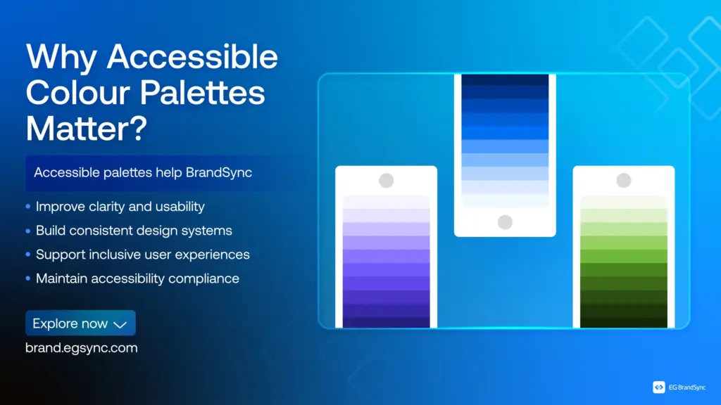
Explore how BrandSync builds accessible color palettes:
Other helpful resources
https://brand.egsync.com/design-system/accessibility
#Accessibility #InclusiveDesign #DesignSystems #WCAG #BrandSync #UXDesign