Blog

  • The New EG Image bank is here.

    The New EG Image bank is here.

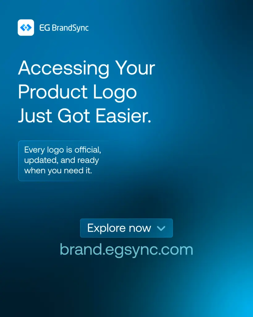
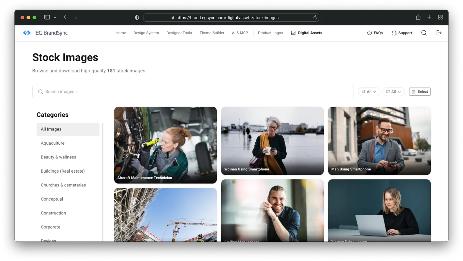
    One place to download all stock images owned by EG.
    We have launched our new shared image bank 🚀

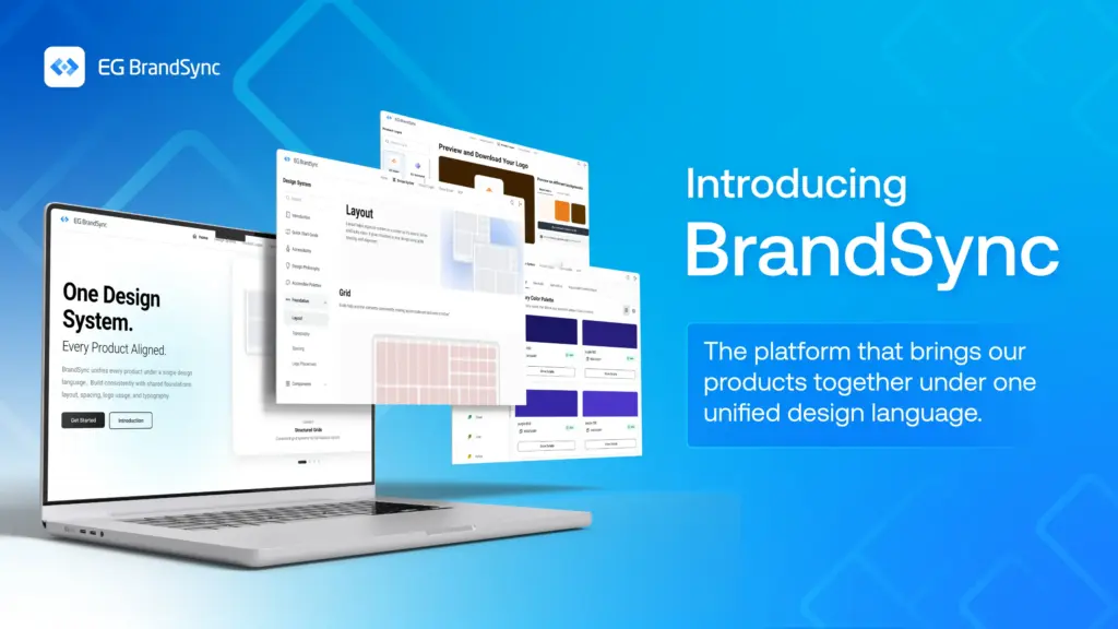
    We are very excited to share that our new company-wide image bank is now live.

    It is not fully updated yet, but it is ready to serve. 🫡

    What is it?

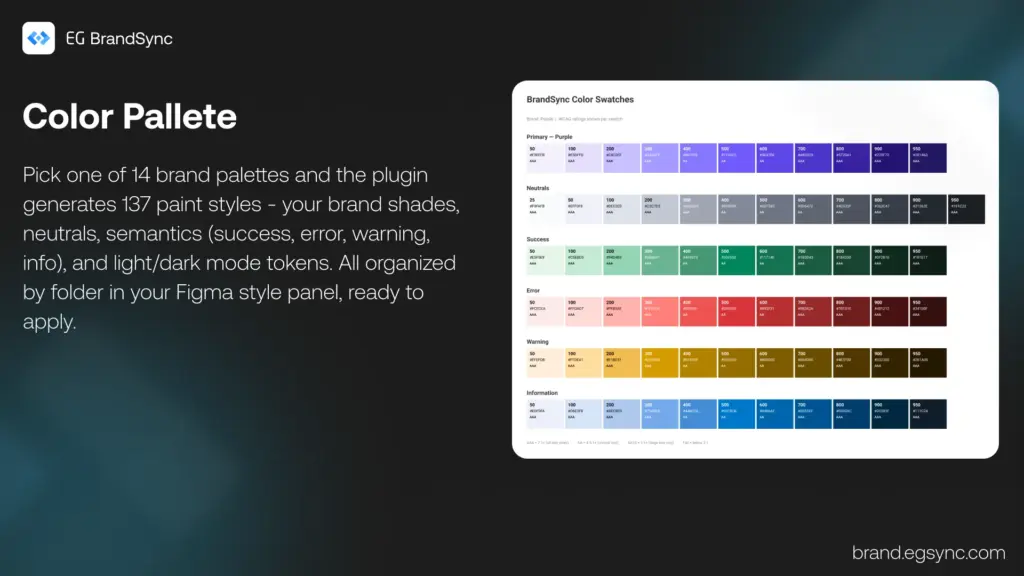
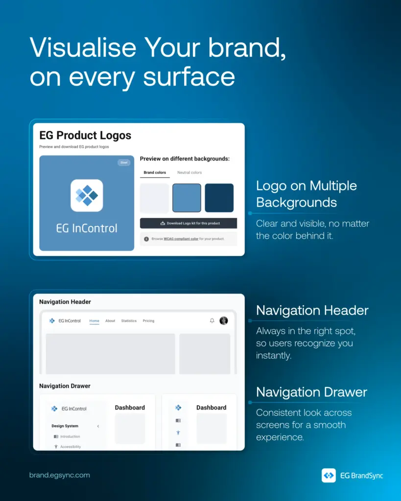
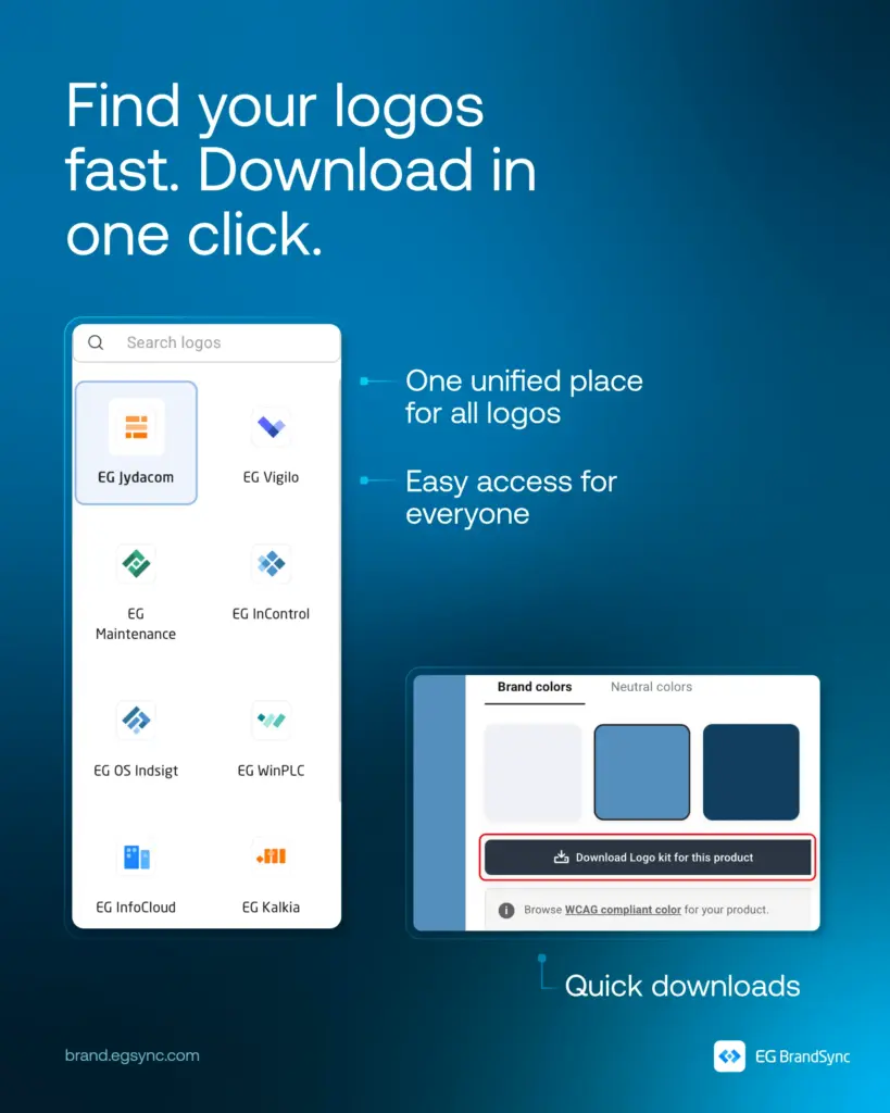
    The image bank is a central place where you can find photos for presentations and other materials.

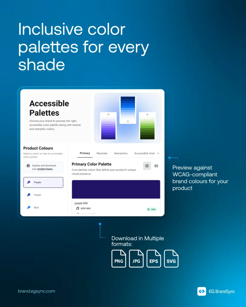
    All images are free to use, brand approved, and represent our different industries.

    We will still keep Templafy, where you can also find approved images. The difference is that this image bank will contain many more photos and give us a stronger overview.

    And yes, it is powered by AI.

    We use AI to help describe and tag the images. That means less manual work for us and much easier search when you are looking for something specific.

    Why are we doing this?
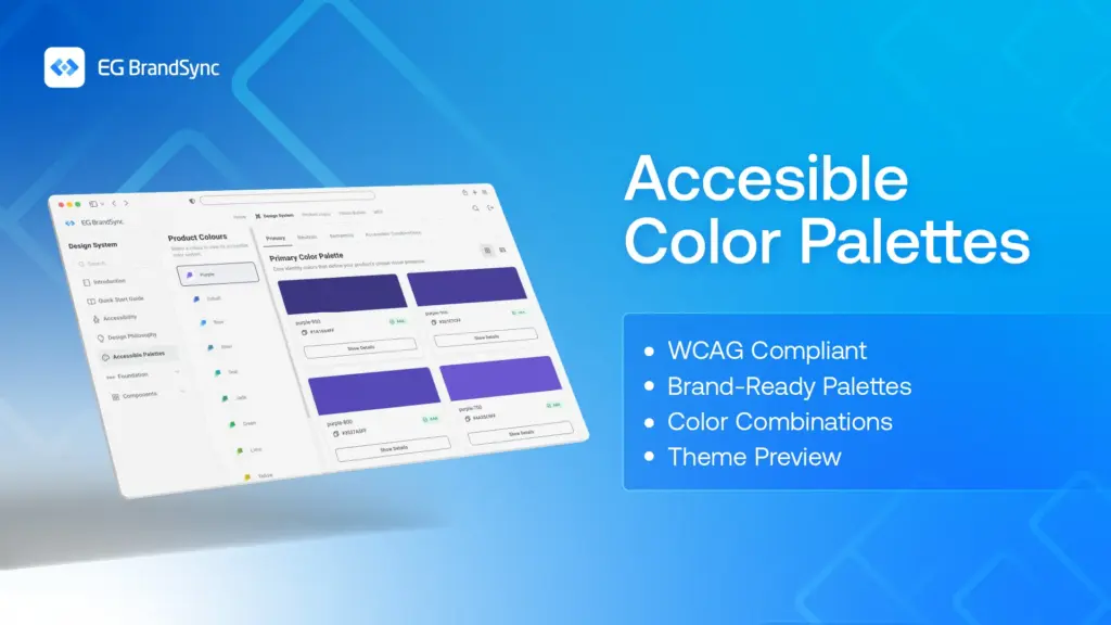
    Accessibility.

    Brand consistency.

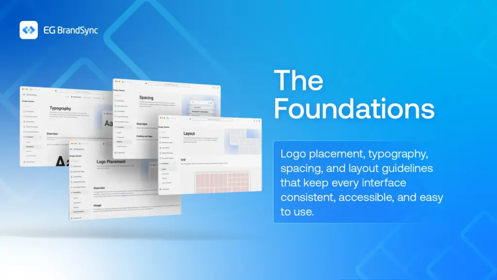
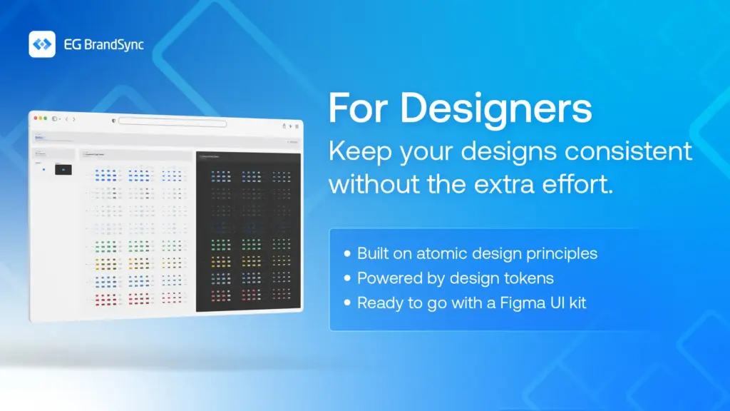
    We are strengthening EG as one brand across platforms and business units. The more consistent we are visually, the stronger and more recognizable we become in the market.

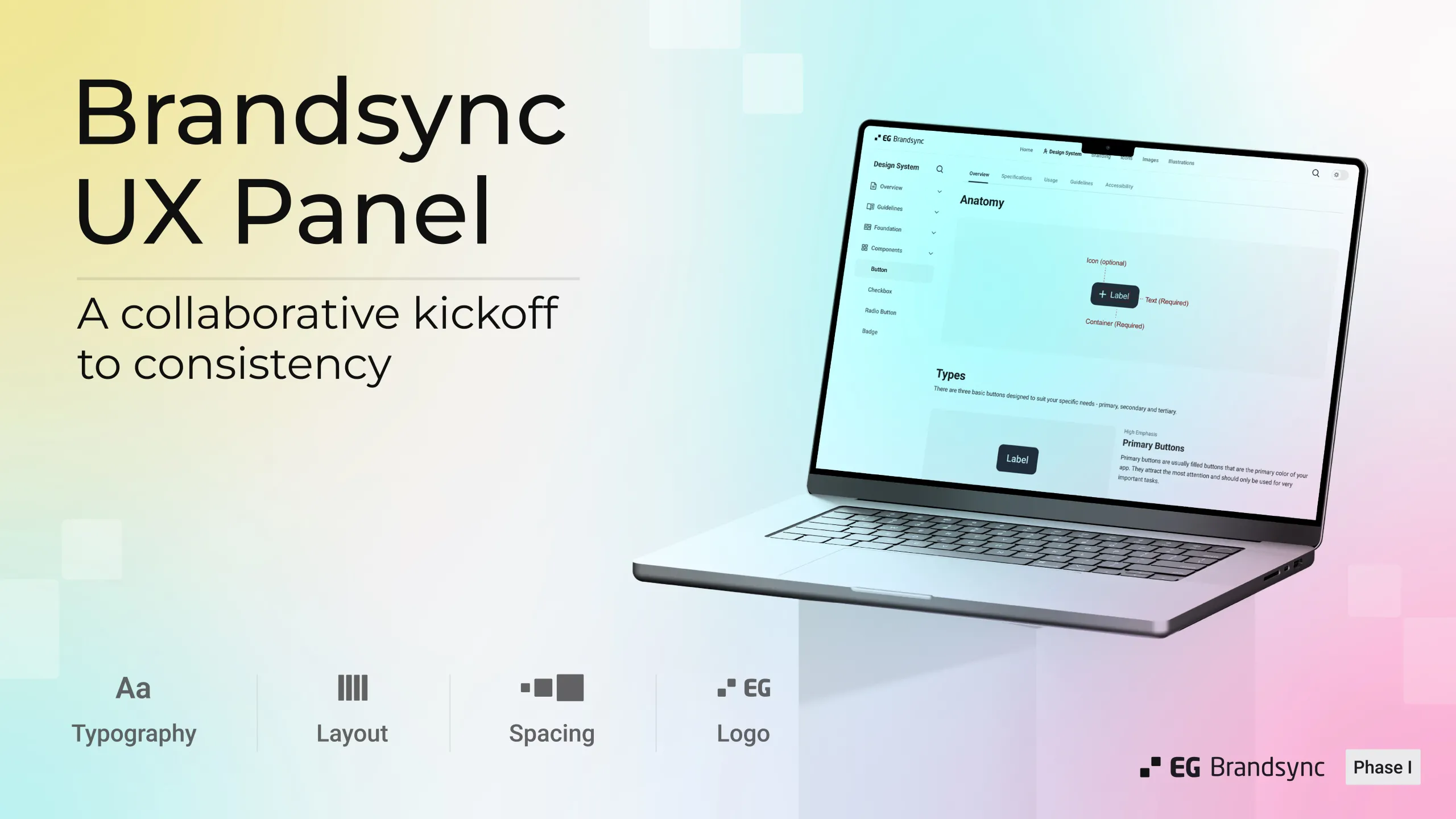
    This project also continues the great collaboration we started during the CVI work. UX, Corporate Communication and Marketing have worked closely together to make this happen.

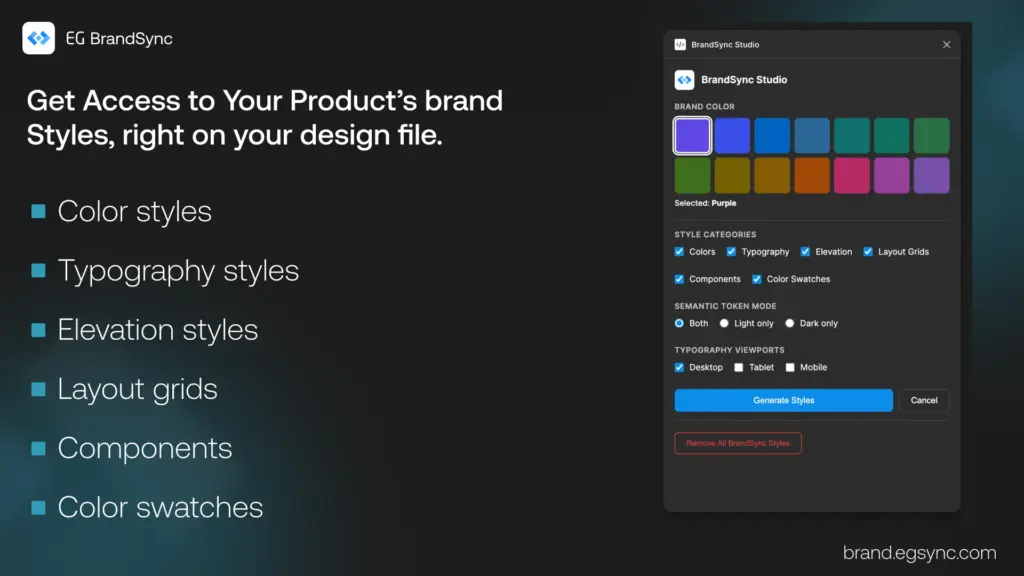
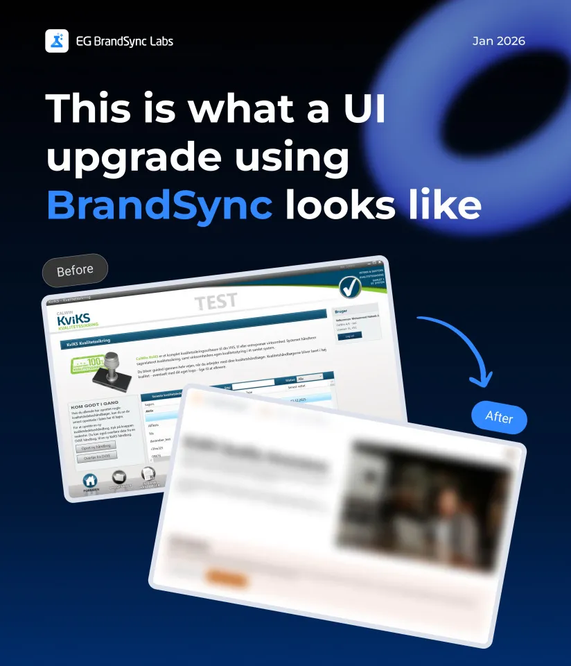
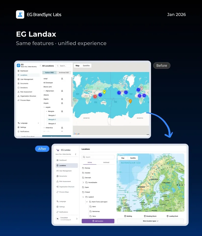
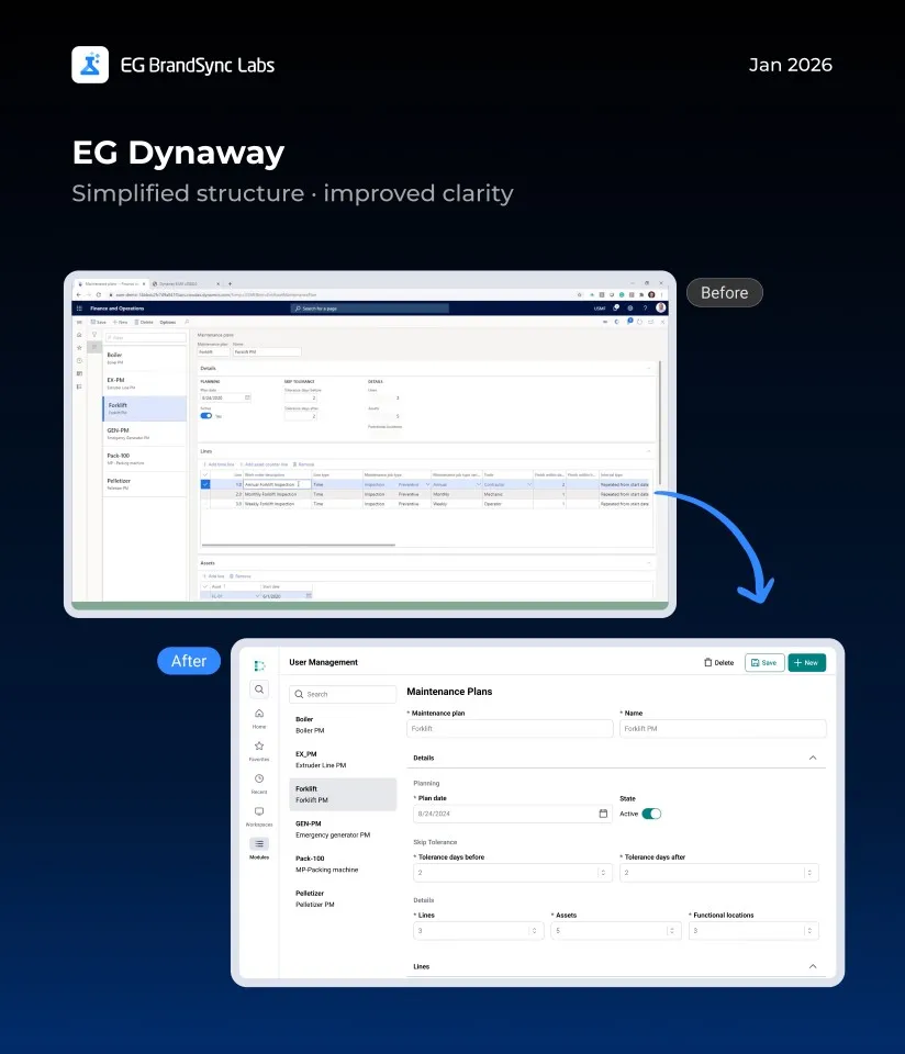
    A big shout out to Manjeeth Shenoy and the UX team for opening up BrandSync for us, and developing functionality to fit a modern repository. This helps ensure that our brand is consistent across both our products and our external communication.

    Check it out: https://brand.egsync.com/digital-assets/stock-images

  • Introducing EG BrandSync in Figma Make

    Introducing EG BrandSync in Figma Make

    You can now generate structured, on-brand UI screens directly from prompts in Figma Make using EG’s official typography, colors, and components.

    This helps you move from idea to interface much faster while staying fully aligned with BrandSync across products.

    How to Access

    Login to figma

    In Figma Make, select:

    EG BrandSync UI Kit (Please refer to the screenshot.)

    You will need Organisation Figma account (Full dev Seat) to use it.

    What You Can Do with BrandSync in Figma Make

    • Generate on-brand screens in seconds • Automatically use official BrandSync components • Maintain visual consistency across products • Prototype quickly without starting from scratch

    Think of it as your acceleration layer for UI creation.

    Full documentation on how to prompt for the best results is available here: https://brand.egsync.com/figma-kit/figma-make

    What This Is Not

    This is not a replacement for UX strategy, research, or product discovery.

    It is a speed layer that helps teams move faster while staying on-brand.

    We look forward to your feedback.

    Happy prototyping

    – Team BrandSync

    Essential BrandSync Resources

    Quick Start Guide

    New Product Logos

    Accessible Color Palettes

    Theme Builder

    BrandSync Figma Kit

    #engage #engageandamplify

  • Say Hello to the new EG PocketLink Mobile App, Powered by BrandSync.

    Say Hello to the new EG PocketLink Mobile App, Powered by BrandSync.

    EG PocketLink has officially joined the BrandSync ecosystem, adopting EG’s unified design foundations while keeping the existing tech stack and framework fully intact. No rebuild. No disruption. Just the power of the right foundations. And the difference is immediately visible.

    What was implemented through BrandSync:

    1. Logo placement Now aligned with EG standards for consistent and confident brand presence
    2. Typography Standardized typography for improved clarity and readability
    3. Spacing system A unified spacing scale creating cleaner, more structured layouts
    4. Colour tokens BrandSync colour tokens integrated for consistency, accessibility, and scalability

    (Read more on BrandSync Foundations)

    And some nifty UX Fixes 🙂

    What this improves

    • Stronger visual hierarchy • Clearer information structure • Improved scalability for future growth • Smarter, more intuitive search and filtering • A consistent, unmistakable EG experience

    This is a great example of how implementing the right foundations can transform a product experience without changing the underlying technology.

    A huge shout-out to the EG PockelLink team for their fantastic collaboration and openness throughout this process. It’s been a pleasure working together, and the results truly speak for themselves.

    Welcome to the BrandSync ecosystem, EG PocketLink. 🙂

    -Team BrandSync

    https://brand.egsync.com

  • Introducing EG BrandSync Studio

    Introducing EG BrandSync Studio

    Excited to share something we have been working on – EG BrandSync Studio, a Figma plugin that lays the foundations of the EG BrandSync design system in one click.

    Pick a brand color, hit generate, and you get:

    • Colors – 14 brand palettes, neutrals, and semantic tokens with light/dark mode support
    • Typography – Responsive text scales for Desktop, Tablet, and Mobile
    • Elevation – 5 shadow levels from subtle to dramatic
    • Layout Grids – Mobile (4-col), Tablet (8-col), and Desktop (12-col)
    • Components – Starter Button, Input, Card, and Badge components
    • Color Swatches – Visual reference with WCAG contrast ratings

    Everything lands in your Figma style panel

    • Organized and ready to use.
    • Re-run safely – existing styles get skipped.
    • One-click cleanup if you want to start fresh.

    Built this to save time setting up new files and keep things consistent across projects. We would love feedback if you give it a try!

    Link to the Figma Plugin: https://www.figma.com/community/plugin/1602933425766782230

    Link to EG BrandSync: brand.egsync.com

  • EG Product Logos on BrandSync

    EG Product Logos on BrandSync

    We’re excited to introduce new EG Product Logos on BrandSync.

    What’s now available:

    • One place to find approved product logos
    • Downloadable assets in JPG, PNG, SVG, EPS, and JPEG
    • WCAG-compliant colour previews for accessible usage
    • Standardised logo usage across interfaces and materials

    By bringing product logos into one unified system, BrandSync helps teams save time, avoid inconsistencies, and maintain a cohesive and professional product identity across EG.

    Your logos are now easier to find. Easier to use. And always up to date.

    Explore Product Logos on BrandSync:

    Logos | EG Brandsync

    Logo Placement Guidelines:

    Logo Placement Guidelines | Navigation Header Guidelines

    We’re continuously adding more logos as we get access to them. If you don’t see your product logo yet, no worries, it’s on the way.

    Happy exploring!

    – EG BrandSync Team

  • What happens when EG products meet BrandSync?

    What happens when EG products meet BrandSync?


    It’s something many of us have been curious about. So we decided to explore it through a small initiative we’re calling BrandSync Labs.

    We reached out to a few BUs and worked with screenshots from their existing products. To explore further, we also used screenshots from products featured on our company website.

    A quick note before we dive in: we know our products are built in very different ways, across structures, technologies, languages, and plenty of real-world constraints. These screens aren’t meant to be perfect or final. Instead, they’re meant to give a feel for how our products could look with a clearly defined design system, and how a more consistent EG experience might come together across products.

    Using only the information available in the screenshots, we recreated these screens with the BrandSync design system. Without changing core features or major flows, we saw how simply applying shared components and guidelines alone can make products feel more consistent, modern, and easier to use.

    Think of this as a conversation starter and a visual reference, not a prescription. We hope it sparks ideas and makes it easier to imagine how BrandSync can support the great work already happening across teams.

    We’ve linked the BrandSync Labs file so you can dive into all the example screens yourself.

    https://www.figma.com/design/vtpWeS2xypB65B2QUIrAHP/BrandSync-X-EG-Products?node-id=0-1&t=n80drIwCnXnhGuT5-1

    Curious about the building blocks? The BrandSync UI Kit is also linked so you can view all the components.

    https://www.figma.com/design/zF98rGtaPpBjSc2PpPK5vo/EG-Brand-Sync-UI-Kit—v1.0?m=auto&node-id=10203-41611&t=27hsfRwTevmQwSl7-1

    Happy designing!

  • EG BrandSync

    EG BrandSync

    2025 has been an incredibly busy and exciting year for EG UX. It has been a while since our last update, but we are finally ready to share some fantastic news.

    EG BrandSync is now ready to go live and the launch date will be announced soon.

    This milestone has been made possible thanks to the tremendous support of the UX community at EG. Designers from across the company have come together, formed a UX governance panel, and laid the foundation BrandSync needs to help unify the look and feel of EG’s products. It is truly inspiring to see different business units rally around one shared goal: “To unify UX at EG.”

    Built for Every Tech Stack

    BrandSync guidelines are designed to be completely technology agnostic and will work seamlessly across all devices including desktops, mobile and tablets. It stands on four key pillars and principles:

    1. Logo placement
    2. Spacing
    3. Typography
    4. Layout

    For Developers

    With our current designer to developer ratio (approximately 1:37, based on our internal case study), we have curated these guidelines to be developer friendly, simple and easy to implement.

    BrandSync includes more than 30 component definitions, each with clear explanations covering:

    1. Overview
    2. Usage
    3. Guidelines
    4. Specifications
    5. Accessibility

    Anyone using them will find the components easy to understand and apply.

    For Designers

    The Figma UI Kit, built on atomic design principles and completely tokenised, includes all the core fundamentals. Designers can jump straight into creating consistent, high confidence interfaces.

    Accessible Colour Palettes

    With the rollout of the new CVI, we now offer WCAG compliant colour palettes with multiple combinations, supporting designers and developers in making accessible and inclusive design choices.

    Collaboration with MarComs

    We have been working closely with EG MarComs to bring our efforts together in unison, especially around logo usage, digital assets and tone of voice. All product logos will be available to be downloaded directly from the BrandSync portal for ease and consistency.

    Digital Asset Library

    Another exciting step is the unification of EG’s entire digital asset library. Approved photos, icons and other assets will be accessible through a single portal, eliminating the need to search through countless SharePoint folders.

    And this is only the beginning. Much more will be coming soon, and we are truly excited for what lies ahead.

    The date of the official launch of BrandSync will be announced soon. 🙂

    A huge shoutout goes to the UX community, the UX governance panel, the Graphics team, the BrandSync team, MarComs and BrandSync developers for bringing this idea to life. This would not have been possible without each and every one of you.

    Special thanks to Mikkel Bardram, Allan Bech, Anand Fernandes, Tine Rasmussen for their constant and unwavering support throughout this journey.

  • EG BrandSync Design System – Review Session

    EG BrandSync Design System – Review Session

    Moving closer to a unified design journey

    Over the last three sessions, the UX panel took a closer look at nine components:

    • Tool Tip
    • Progress Indicator
    • Progress Stepper
    • Cards
    • Snack Bar
    • Dialog
    • List
    • Slider
    • Accordion

    Progress so far:

    • 22 components reviewed
    • 9 more to go

    We discussed them in terms of overview, specifications, usage, guidelines, and accessibility.

    Each session concluded with clear next steps for refining the components. With every review, we’re not just polishing the design system, we’re making it more consistent, inclusive, and reliable for everyone who uses EG products.

    Thanks to everyone who joined in. Your input continues to shape a stronger foundation for the journey ahead.

  • EG BrandSync Design System – Fifth Review

    EG BrandSync Design System – Fifth Review

    Moving forward towards a unified UX journey

    After a refreshing break, our UX panel reconvened for the fifth review session.

    Session focus

    • Components reviewed: Link, Breadcrumb, Pagination
    • Areas covered: Specifications • Usage • Guidelines • Accessibility

    Key highlights

    • Insight-rich, productive discussions with clear improvement ideas
    • Practical suggestions to enhance functionality and user experience
    • Feedback that was actionable, relevant, and grounded in real-world needs

    The session concluded with clear next steps for refining all three components. With each review, we’re moving closer to a consistent, accessible design system that works seamlessly across all EG products.

    A big thank you to everyone who joined in! Each session strengthens the foundation for all our EG products.

  • EG BrandSync Design System – Third Review

    EG BrandSync Design System – Third Review

    Another Step Towards a Seamless UX

    Our amazing UX panel came together once again, this time to review four key components:

    • Tabs
    • Switch
    • Chips
    • Menu

    With this session, we’ve now reviewed a total of 10 components. A solid milestone on our journey!

    As always, the feedback was real, relevant, and incredibly helpful. Every suggestion brings us closer to a design system that truly works for everyone at EG.

    Thanks to everyone who joined in. The system keeps getting stronger every time we come together.

    Let’s keep building BrandSync together!