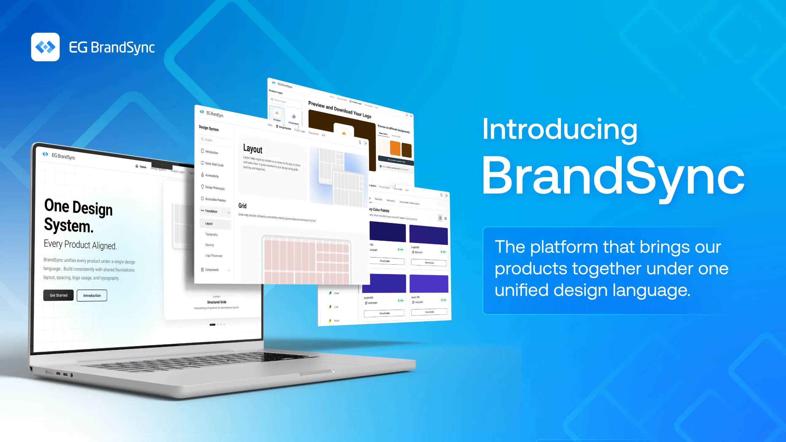
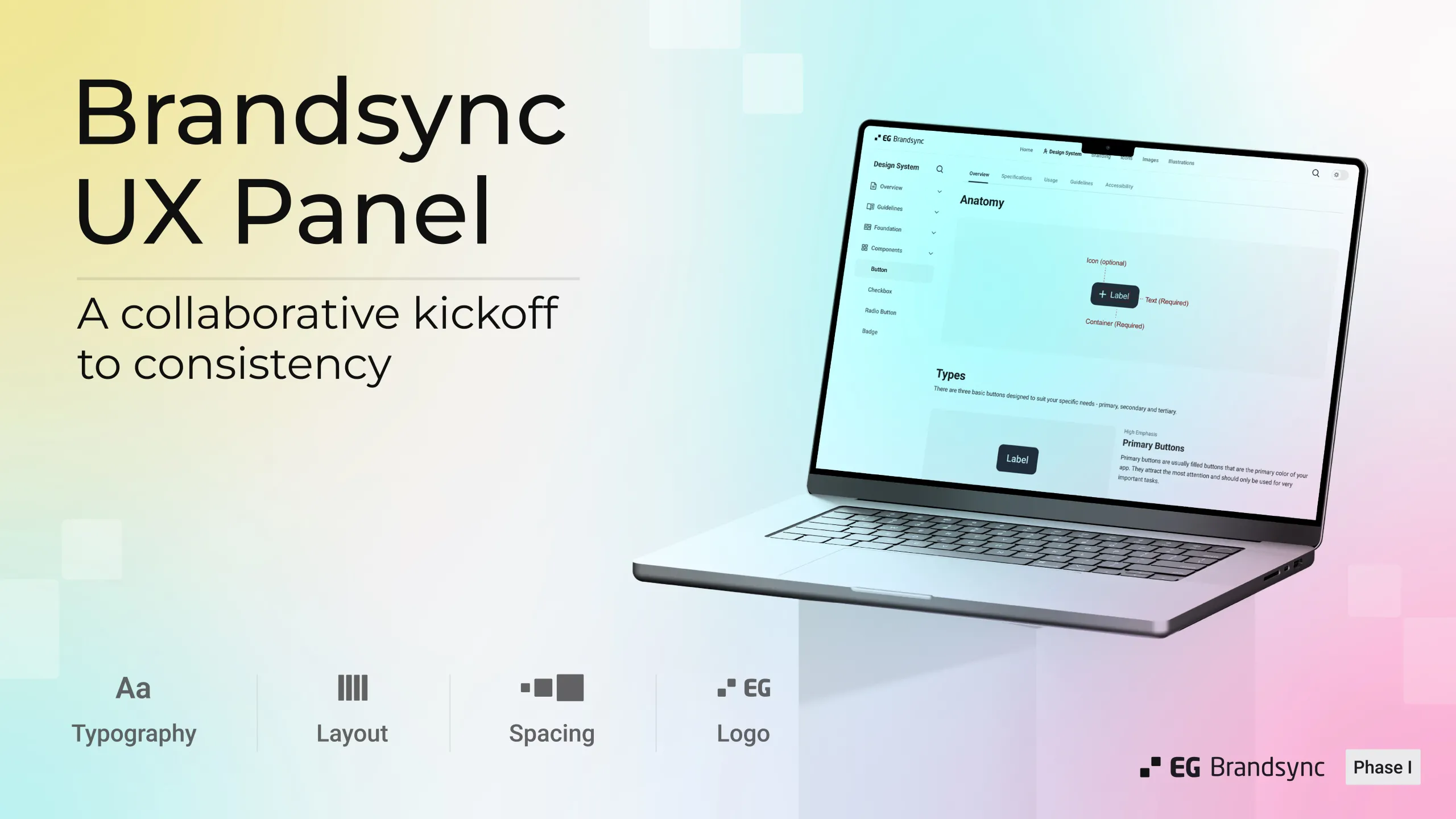
Over the past few months, it has been amazing to see how quickly BrandSync has grown across EG. What started as a shared space for design assets is now becoming a platform that teams across business units actively use to create, collaborate, and stay aligned.
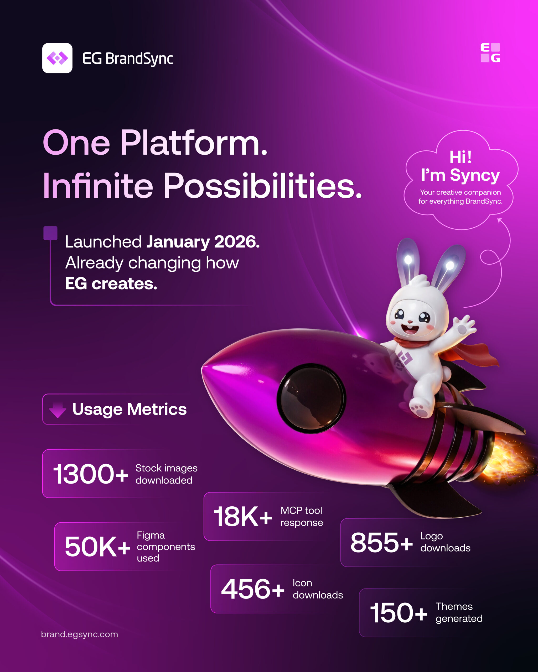
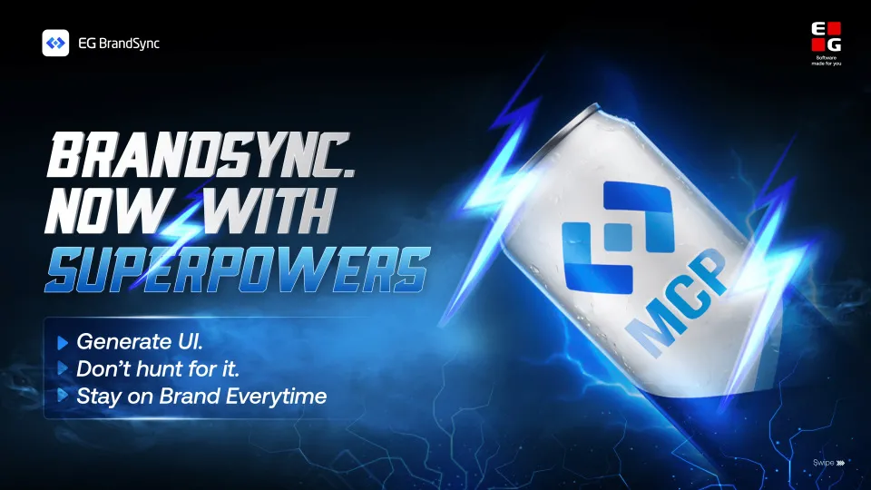
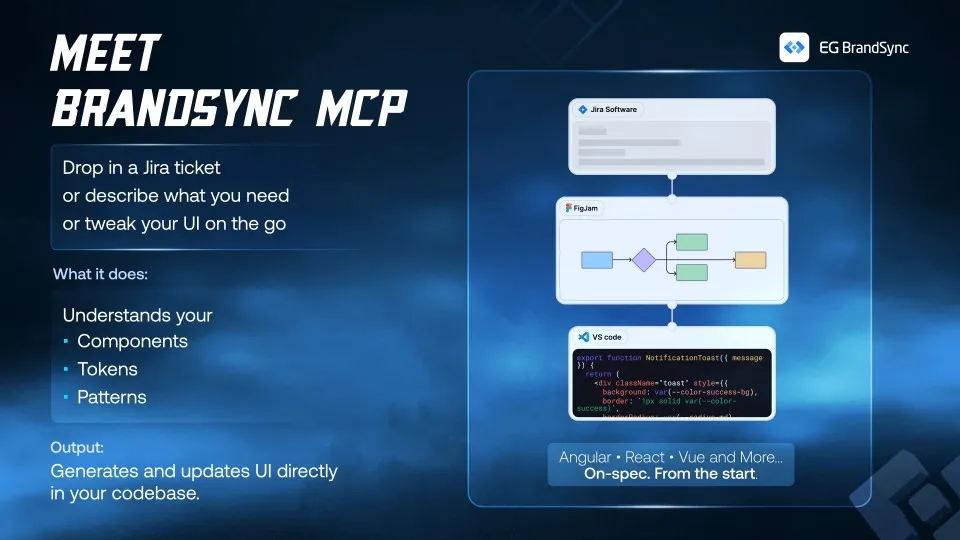
Since launching in January 2026, BrandSync has brought together Figma kits, product logos, brand guidelines, icons, stock assets, MCP and much more into one shared ecosystem.
And the adoption so far has been incredible: Here are some numbers:
What excites us most is seeing teams use BrandSync in their daily workflows to move faster, stay consistent, and spend less time rebuilding or searching for assets.
A huge thank you to everyone across EG who has contributed, tested features, shared feedback, uploaded assets, and helped shape the platform along the way. We are only getting started.
And finally, meet Syncy. Our very happy BrandSync mascot. Expect to see a lot more of him in future posts alongside the rest of the BrandSync journey.
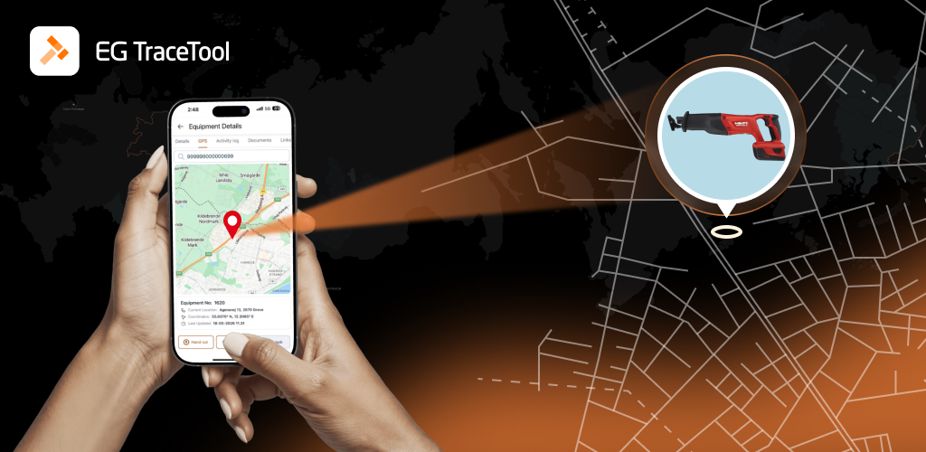
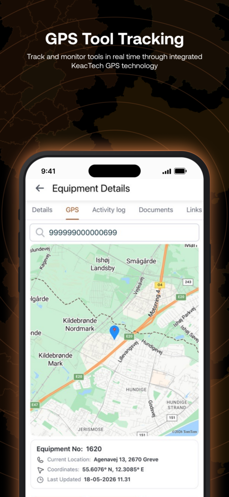
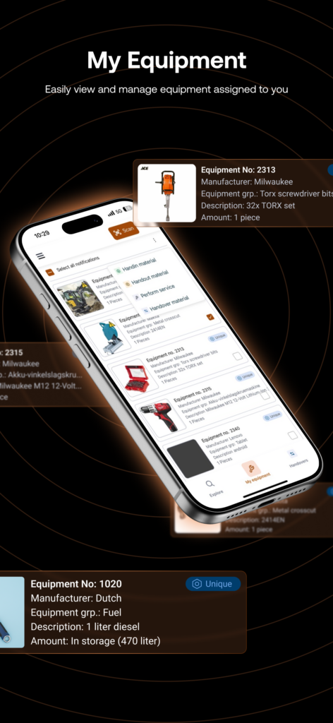
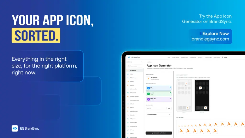
The BrandSync team had an incredible opportunity to collaborate with the amazing team at EG Construction on the EG Tracetool mobile app, and it has been such an exciting journey from start to finish.
Today, the app officially reached customers with the beta version, and we are genuinely proud of how everything has come together.
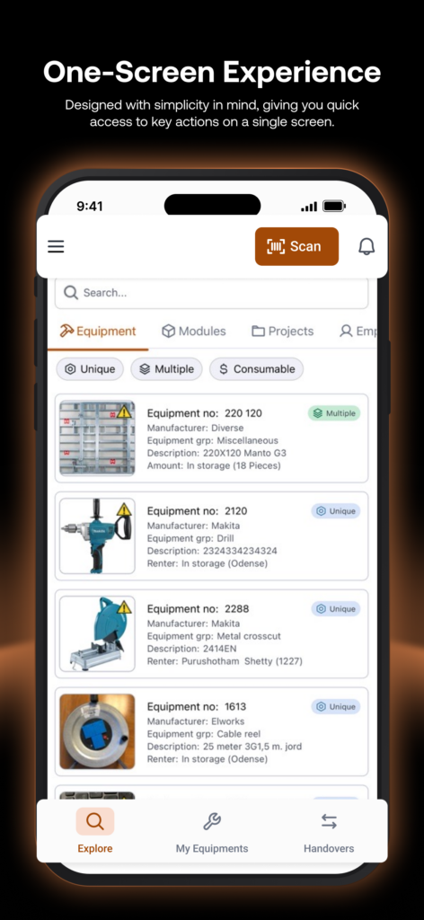
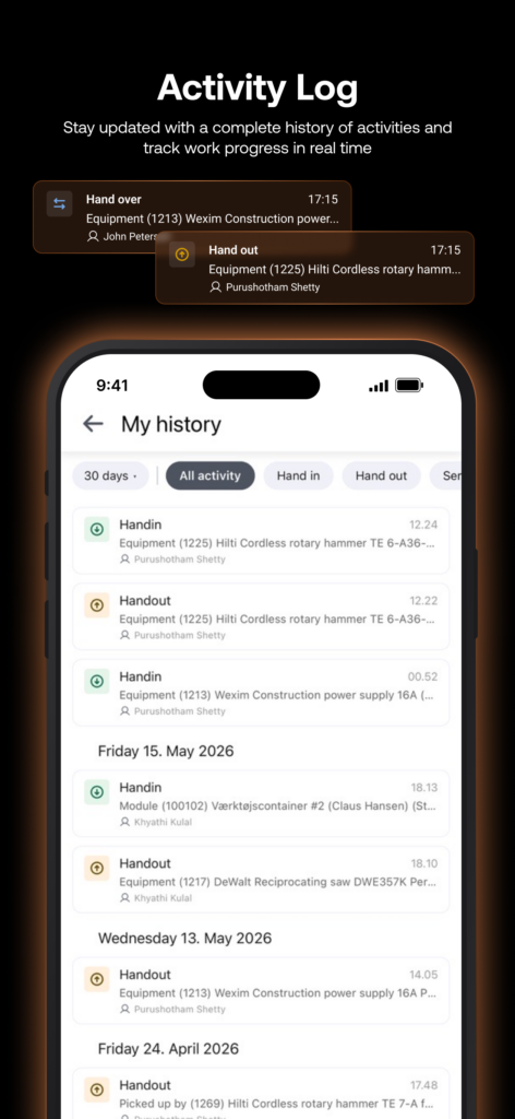
This was a complete redesign experience for us. We revisited the entire app workflow, carefully mapped the full user journey, and rethought the experience step by step. From early low fidelity concepts and wireframes to polished high fidelity designs, every stage was crafted with care using the BrandSync ecosystem and ingredients.
What made this project even more special was the collaboration behind it. A great product is always built by passionate people working together, and the Tracetool team brought exactly that energy throughout the journey.
A huge thank you to everyone involved. We are excited to see the new EG Tracetool experience in the hands of customers 🚀
Convert between HEX, RGB, HSL, and CMYK. Edit any format and all others update instantly. Use HEX and RGB for web and digital, HSL for UI theming, and CMYK for print production.
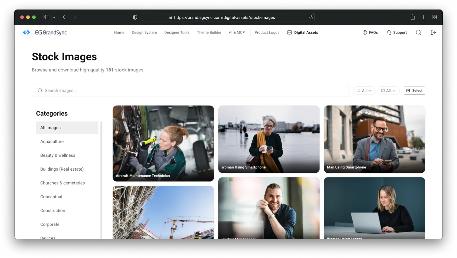
One place to download all stock images owned by EG. We have launched our new shared image bank 🚀
We are very excited to share that our new company-wide image bank is now live.
It is not fully updated yet, but it is ready to serve. 🫡
What is it?
The image bank is a central place where you can find photos for presentations and other materials.
All images are free to use, brand approved, and represent our different industries.
We will still keep Templafy, where you can also find approved images. The difference is that this image bank will contain many more photos and give us a stronger overview.
And yes, it is powered by AI.
We use AI to help describe and tag the images. That means less manual work for us and much easier search when you are looking for something specific.
Why are we doing this?
Accessibility.
Brand consistency.
We are strengthening EG as one brand across platforms and business units. The more consistent we are visually, the stronger and more recognizable we become in the market.
This project also continues the great collaboration we started during the CVI work. UX, Corporate Communication and Marketing have worked closely together to make this happen.
A big shout out to Manjeeth Shenoy and the UX team for opening up BrandSync for us, and developing functionality to fit a modern repository. This helps ensure that our brand is consistent across both our products and our external communication.
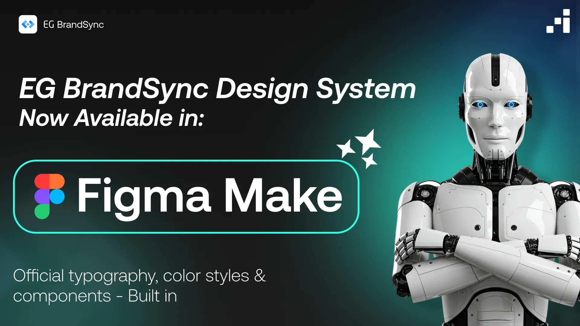
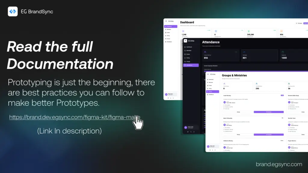
You can now generate structured, on-brand UI screens directly from prompts in Figma Make using EG’s official typography, colors, and components.
This helps you move from idea to interface much faster while staying fully aligned with BrandSync across products.
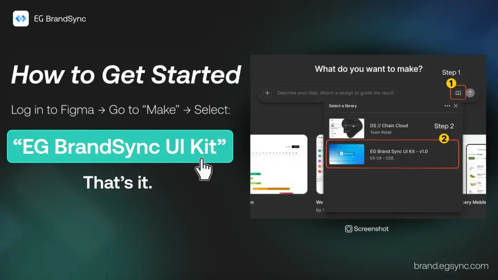
How to Access
Login to figma
In Figma Make, select:
EG BrandSync UI Kit (Please refer to the screenshot.)
You will need Organisation Figma account (Full dev Seat) to use it.
What You Can Do with BrandSync in Figma Make
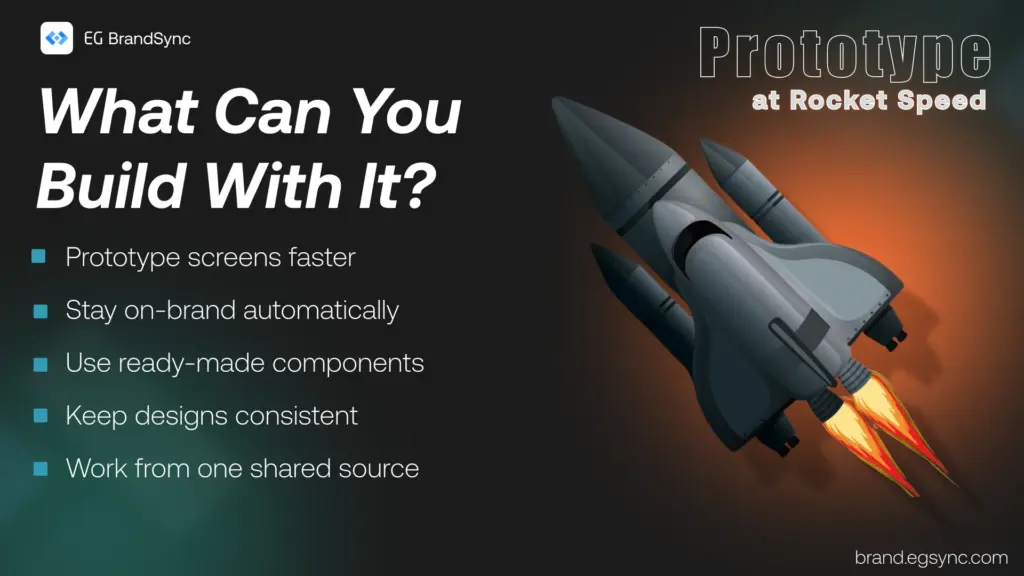
• Generate on-brand screens in seconds • Automatically use official BrandSync components • Maintain visual consistency across products • Prototype quickly without starting from scratch
Think of it as your acceleration layer for UI creation.
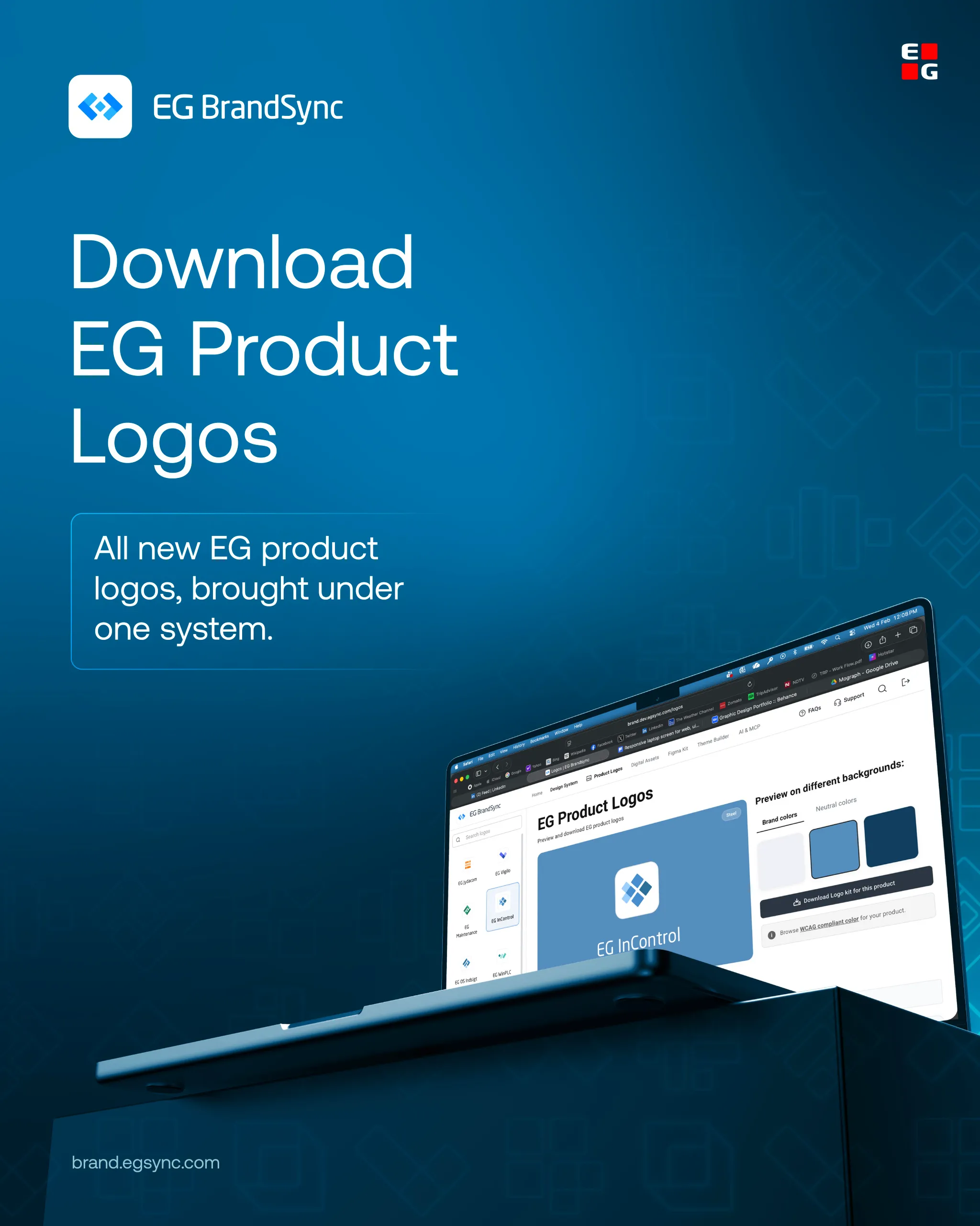
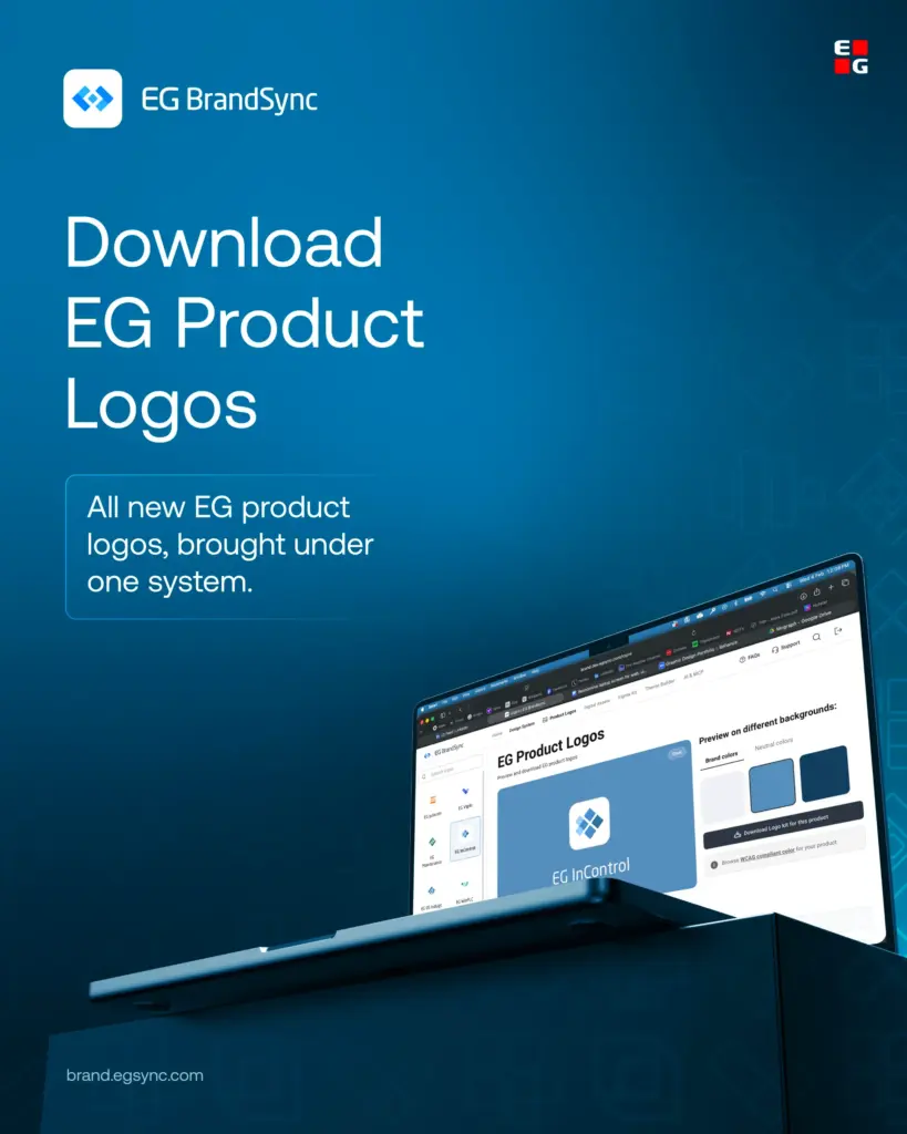
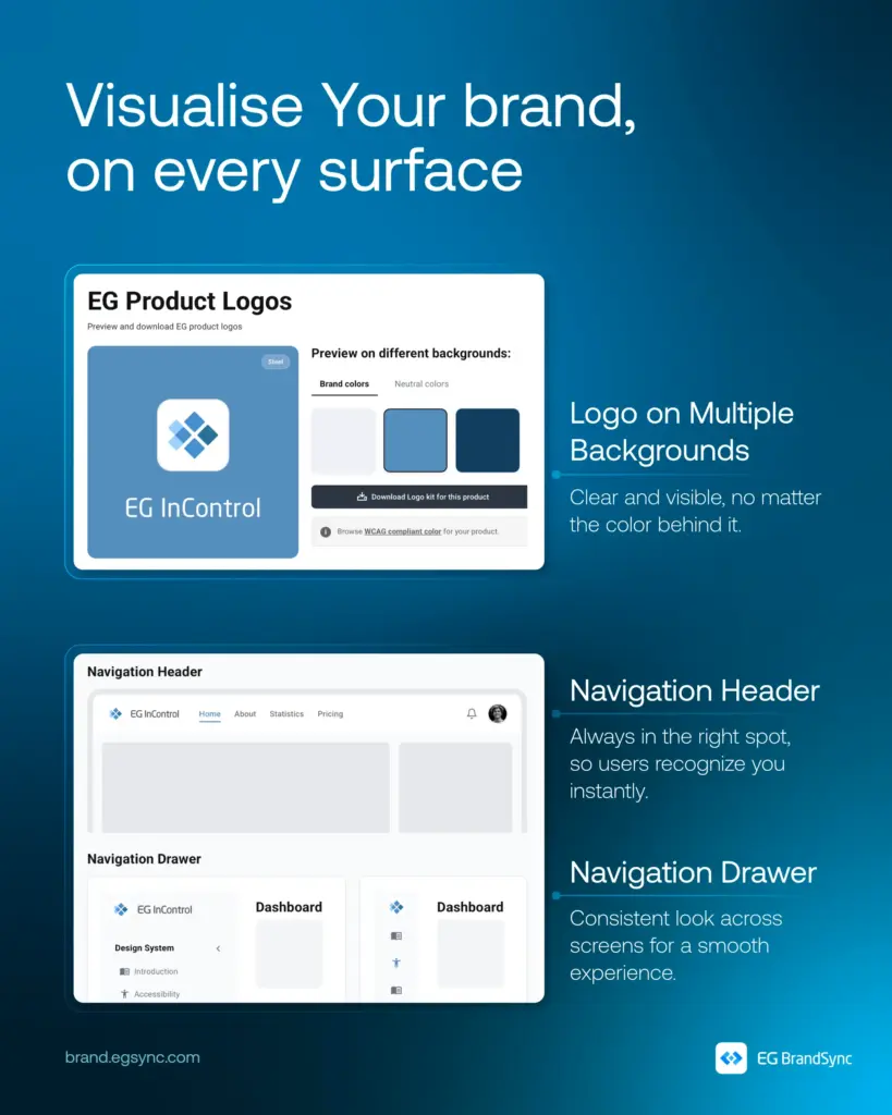
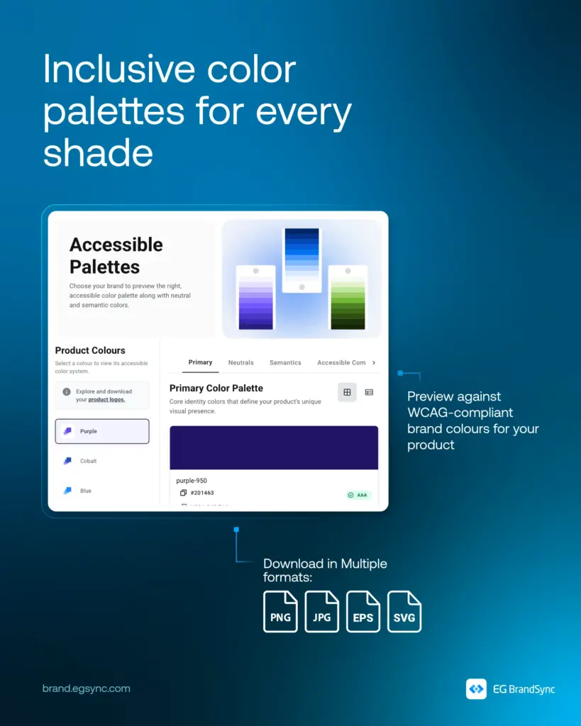
We’re excited to introduce new EGProduct Logos on BrandSync.
What’s now available:
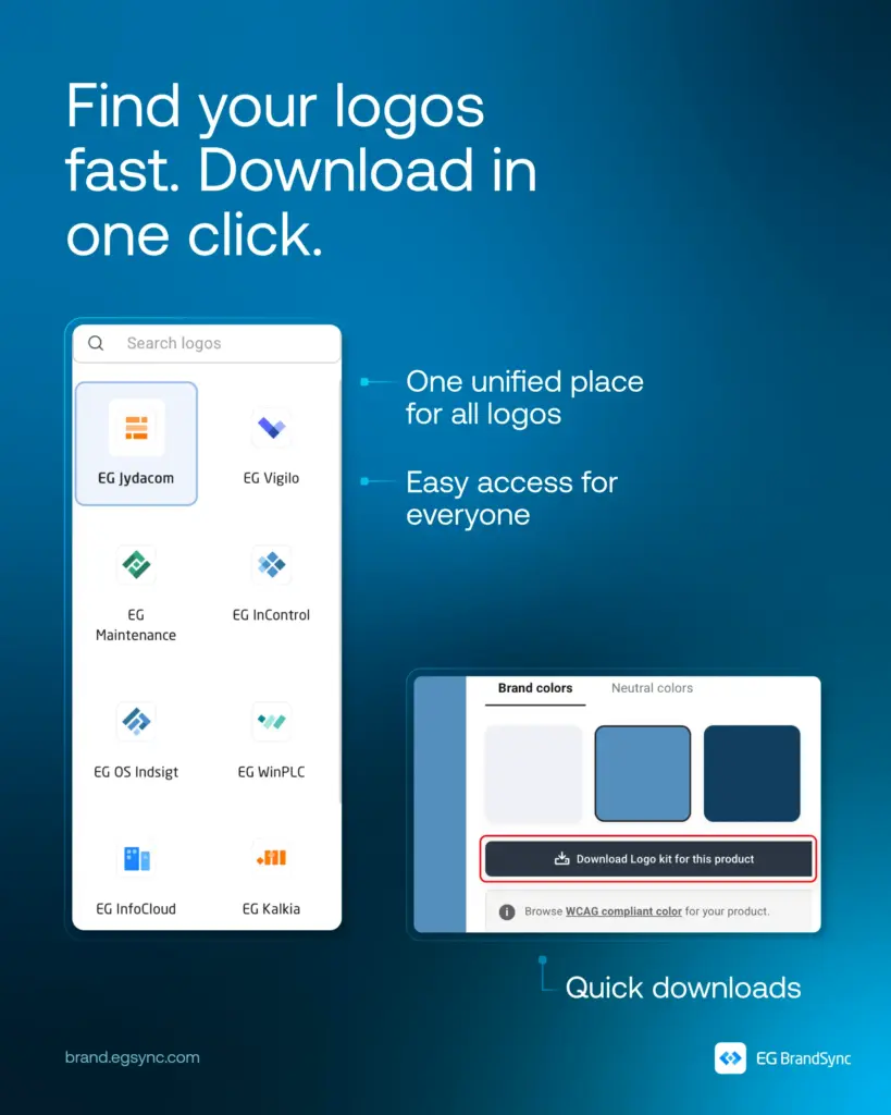
One place to find approved product logos
Downloadable assets in JPG, PNG, SVG, EPS, and JPEG
WCAG-compliant colour previews for accessible usage
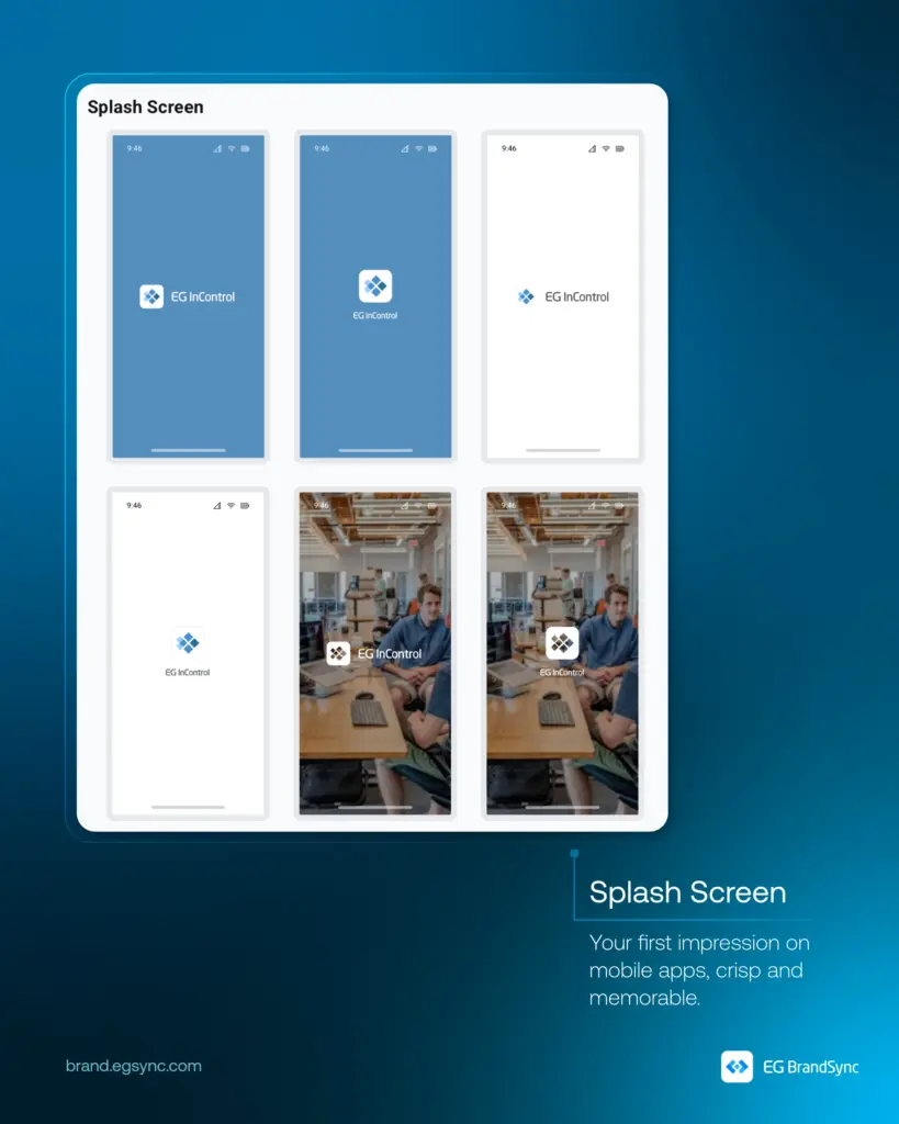
Standardised logo usage across interfaces and materials
By bringing product logos into one unified system, BrandSync helps teams save time, avoid inconsistencies, and maintain a cohesive and professional product identity across EG.
Your logos are now easier to find. Easier to use. And always up to date.
2025 has been an incredibly busy and exciting year for EG UX. It has been a while since our last update, but we are finally ready to share some fantastic news.
EG BrandSync is now ready to go live and the launch date will be announced soon.
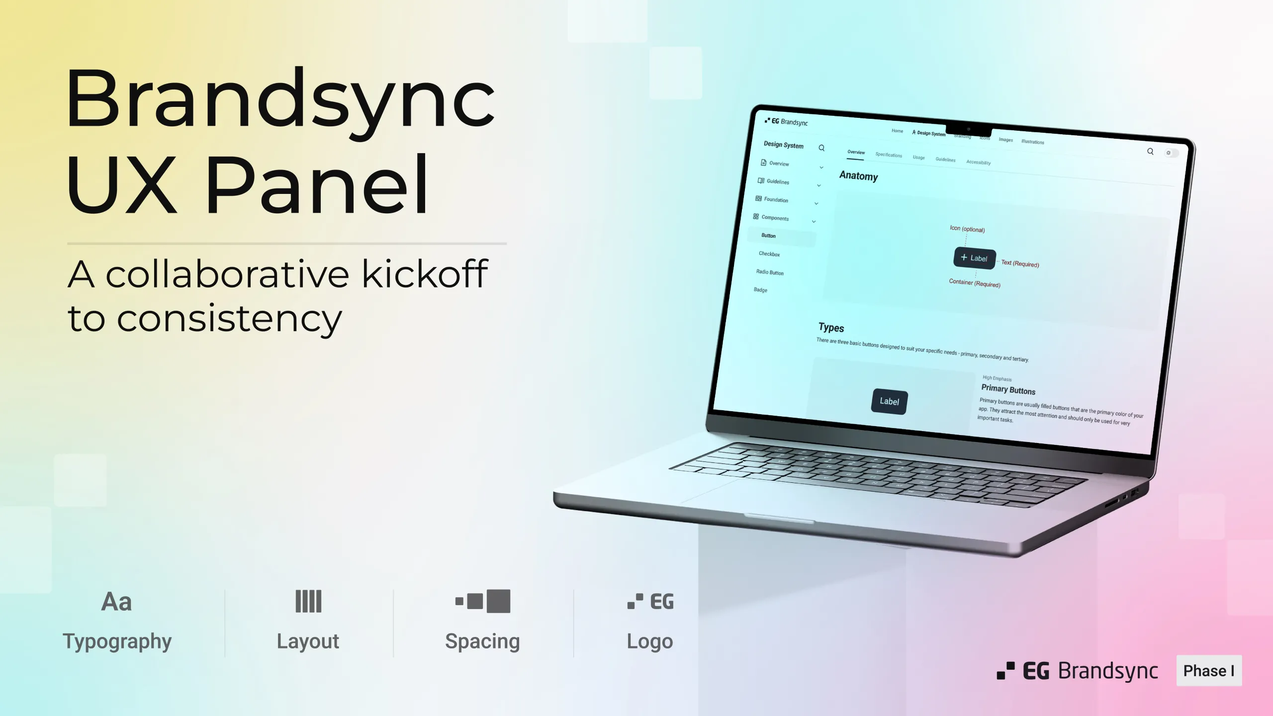
This milestone has been made possible thanks to the tremendous support of the UX community at EG. Designers from across the company have come together, formed a UX governance panel, and laid the foundation BrandSync needs to help unify the look and feel of EG’s products. It is truly inspiring to see different business units rally around one shared goal: “To unify UX at EG.”
Built for Every Tech Stack
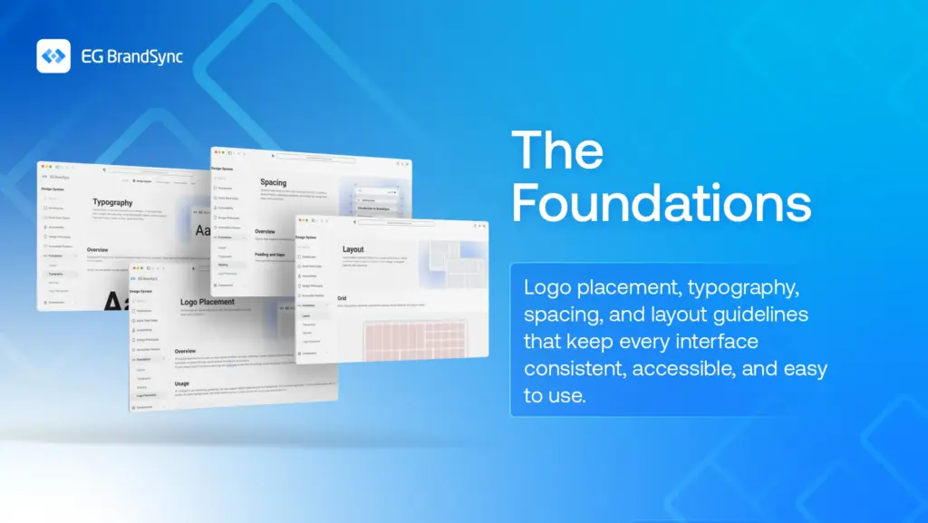
BrandSync guidelines are designed to be completely technology agnostic and will work seamlessly across all devices including desktops, mobile and tablets. It stands on four key pillars and principles:
Logo placement
Spacing
Typography
Layout
For Developers
With our current designer to developer ratio (approximately 1:37, based on our internal case study), we have curated these guidelines to be developer friendly, simple and easy to implement.
BrandSync includes more than 30 component definitions, each with clear explanations covering:
Overview
Usage
Guidelines
Specifications
Accessibility
Anyone using them will find the components easy to understand and apply.
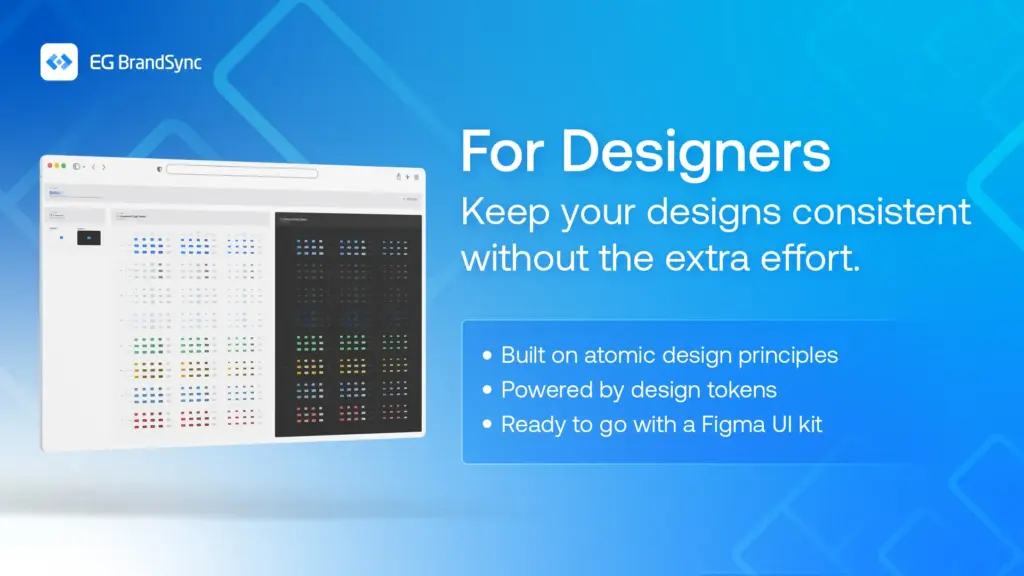
For Designers
The Figma UI Kit, built on atomic design principles and completely tokenised, includes all the core fundamentals. Designers can jump straight into creating consistent, high confidence interfaces.
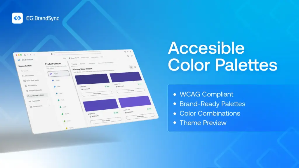
Accessible Colour Palettes
With the rollout of the new CVI, we now offer WCAG compliant colour palettes with multiple combinations, supporting designers and developers in making accessible and inclusive design choices.
Collaboration with MarComs
We have been working closely with EG MarComs to bring our efforts together in unison, especially around logo usage, digital assets and tone of voice. All product logos will be available to be downloaded directly from the BrandSync portal for ease and consistency.
Digital Asset Library
Another exciting step is the unification of EG’s entire digital asset library. Approved photos, icons and other assets will be accessible through a single portal, eliminating the need to search through countless SharePoint folders.
And this is only the beginning. Much more will be coming soon, and we are truly excited for what lies ahead.
The date of the official launch of BrandSync will be announced soon. 🙂
A huge shoutout goes to the UX community, the UX governance panel, the Graphics team, the BrandSync team, MarComs and BrandSync developers for bringing this idea to life. This would not have been possible without each and every one of you.
Over the last three sessions, the UX panel took a closer look at nine components:
Tool Tip
Progress Indicator
Progress Stepper
Cards
Snack Bar
Dialog
List
Slider
Accordion
Progress so far:
22 components reviewed
9 more to go
We discussed them in terms of overview, specifications, usage, guidelines, and accessibility.
Each session concluded with clear next steps for refining the components. With every review, we’re not just polishing the design system, we’re making it more consistent, inclusive, and reliable for everyone who uses EG products.
Thanks to everyone who joined in. Your input continues to shape a stronger foundation for the journey ahead.
Our amazing UX panel came together once again, this time to review four key components:
Tabs
Switch
Chips
Menu
With this session, we’ve now reviewed a total of 10 components. A solid milestone on our journey!
As always, the feedback was real, relevant, and incredibly helpful. Every suggestion brings us closer to a design system that truly works for everyone at EG.
Thanks to everyone who joined in. The system keeps getting stronger every time we come together.