Author: Mehnaz Zahur

  • EG BrandSync

    EG BrandSync

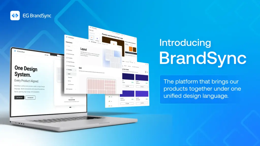
    2025 has been an incredibly busy and exciting year for EG UX. It has been a while since our last update, but we are finally ready to share some fantastic news.

    EG BrandSync is now ready to go live and the launch date will be announced soon.

    This milestone has been made possible thanks to the tremendous support of the UX community at EG. Designers from across the company have come together, formed a UX governance panel, and laid the foundation BrandSync needs to help unify the look and feel of EG’s products. It is truly inspiring to see different business units rally around one shared goal: “To unify UX at EG.”

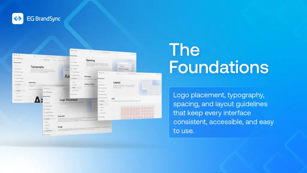
    Built for Every Tech Stack

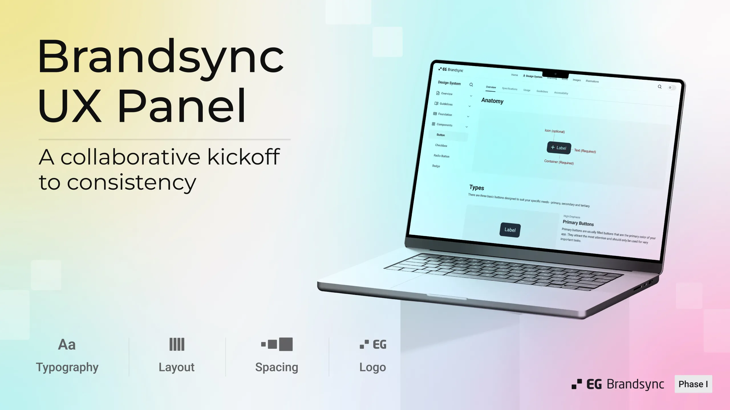
    BrandSync guidelines are designed to be completely technology agnostic and will work seamlessly across all devices including desktops, mobile and tablets. It stands on four key pillars and principles:

    1. Logo placement
    2. Spacing
    3. Typography
    4. Layout

    For Developers

    With our current designer to developer ratio (approximately 1:37, based on our internal case study), we have curated these guidelines to be developer friendly, simple and easy to implement.

    BrandSync includes more than 30 component definitions, each with clear explanations covering:

    1. Overview
    2. Usage
    3. Guidelines
    4. Specifications
    5. Accessibility

    Anyone using them will find the components easy to understand and apply.
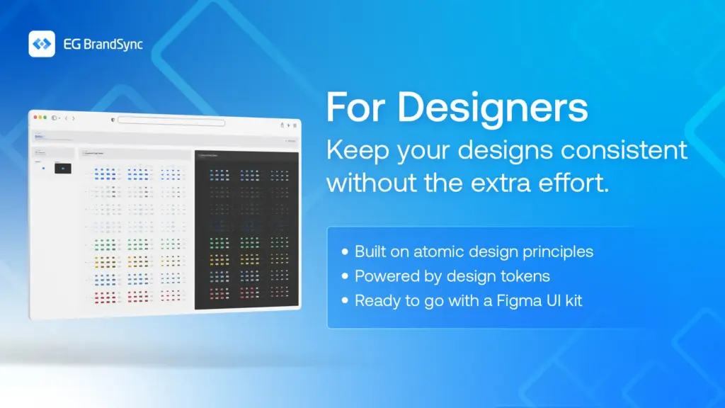
    For Designers

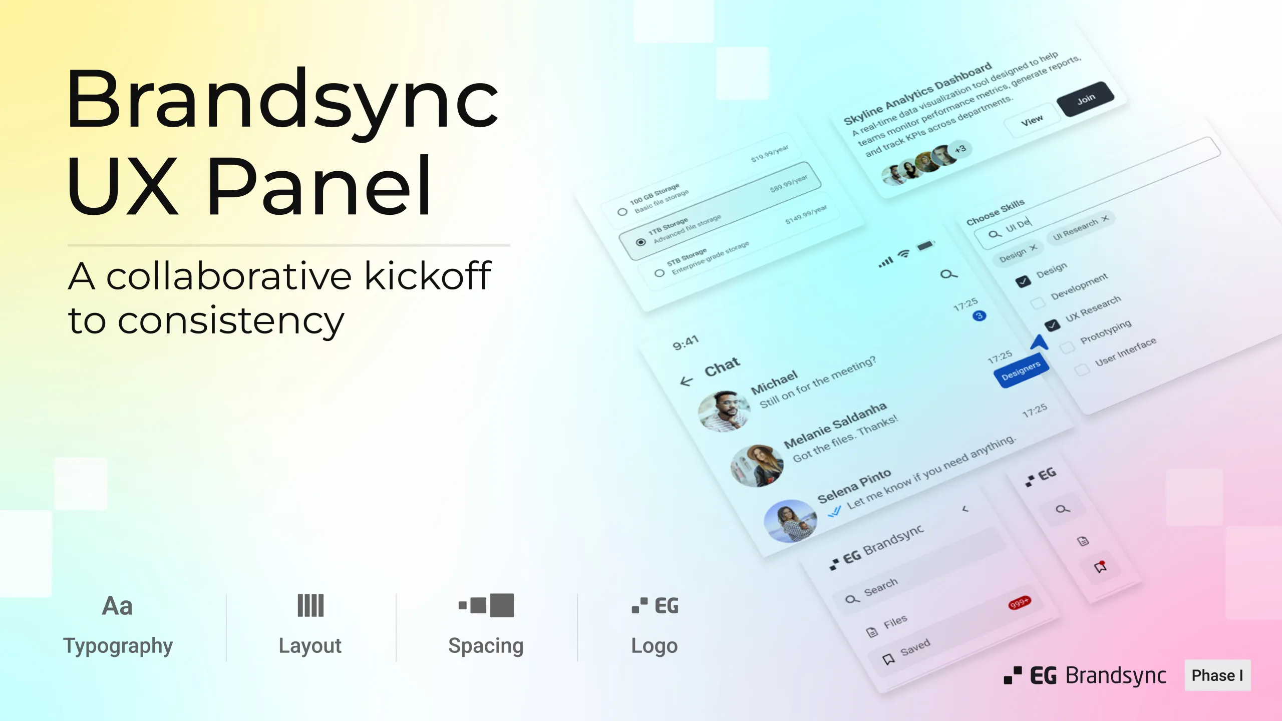
    The Figma UI Kit, built on atomic design principles and completely tokenised, includes all the core fundamentals. Designers can jump straight into creating consistent, high confidence interfaces.

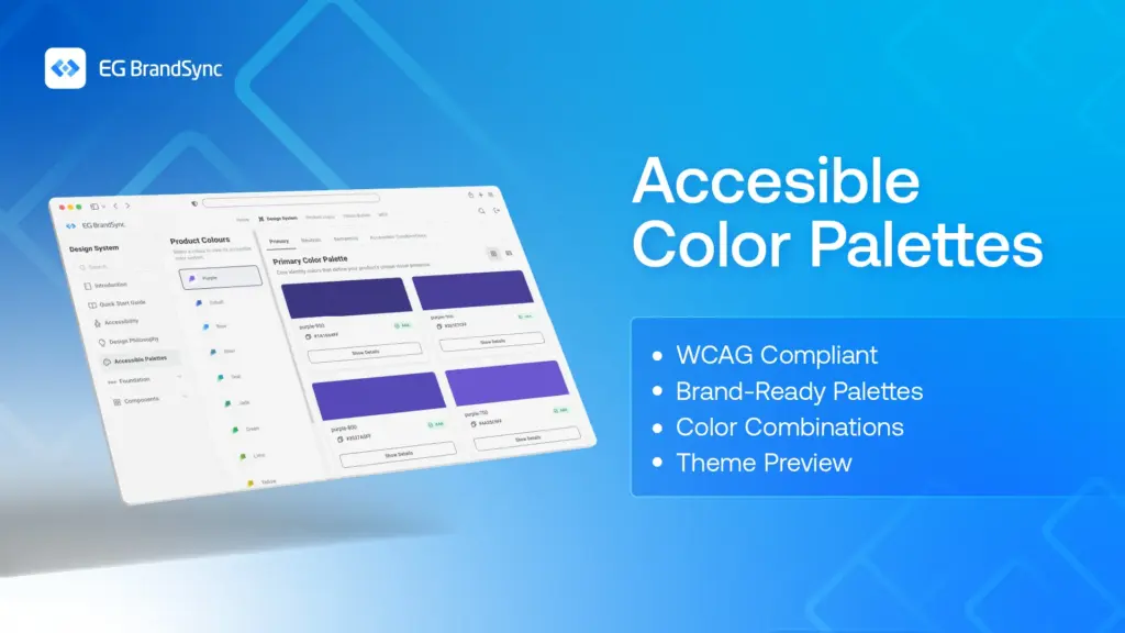
    Accessible Colour Palettes

    With the rollout of the new CVI, we now offer WCAG compliant colour palettes with multiple combinations, supporting designers and developers in making accessible and inclusive design choices.

    Collaboration with MarComs

    We have been working closely with EG MarComs to bring our efforts together in unison, especially around logo usage, digital assets and tone of voice. All product logos will be available to be downloaded directly from the BrandSync portal for ease and consistency.

    Digital Asset Library

    Another exciting step is the unification of EG’s entire digital asset library. Approved photos, icons and other assets will be accessible through a single portal, eliminating the need to search through countless SharePoint folders.

    And this is only the beginning. Much more will be coming soon, and we are truly excited for what lies ahead.

    The date of the official launch of BrandSync will be announced soon. 🙂

    A huge shoutout goes to the UX community, the UX governance panel, the Graphics team, the BrandSync team, MarComs and BrandSync developers for bringing this idea to life. This would not have been possible without each and every one of you.

    Special thanks to Mikkel Bardram, Allan Bech, Anand Fernandes, Tine Rasmussen for their constant and unwavering support throughout this journey.

  • EG BrandSync Design System – Review Session

    EG BrandSync Design System – Review Session

    Moving closer to a unified design journey

    Over the last three sessions, the UX panel took a closer look at nine components:

    • Tool Tip
    • Progress Indicator
    • Progress Stepper
    • Cards
    • Snack Bar
    • Dialog
    • List
    • Slider
    • Accordion

    Progress so far:

    • 22 components reviewed
    • 9 more to go

    We discussed them in terms of overview, specifications, usage, guidelines, and accessibility.

    Each session concluded with clear next steps for refining the components. With every review, we’re not just polishing the design system, we’re making it more consistent, inclusive, and reliable for everyone who uses EG products.

    Thanks to everyone who joined in. Your input continues to shape a stronger foundation for the journey ahead.

  • EG BrandSync Design System – Fifth Review

    EG BrandSync Design System – Fifth Review

    Moving forward towards a unified UX journey

    After a refreshing break, our UX panel reconvened for the fifth review session.

    Session focus

    • Components reviewed: Link, Breadcrumb, Pagination
    • Areas covered: Specifications • Usage • Guidelines • Accessibility

    Key highlights

    • Insight-rich, productive discussions with clear improvement ideas
    • Practical suggestions to enhance functionality and user experience
    • Feedback that was actionable, relevant, and grounded in real-world needs

    The session concluded with clear next steps for refining all three components. With each review, we’re moving closer to a consistent, accessible design system that works seamlessly across all EG products.

    A big thank you to everyone who joined in! Each session strengthens the foundation for all our EG products.

  • EG BrandSync Design System – Third Review

    EG BrandSync Design System – Third Review

    Another Step Towards a Seamless UX

    Our amazing UX panel came together once again, this time to review four key components:

    • Tabs
    • Switch
    • Chips
    • Menu

    With this session, we’ve now reviewed a total of 10 components. A solid milestone on our journey!

    As always, the feedback was real, relevant, and incredibly helpful. Every suggestion brings us closer to a design system that truly works for everyone at EG.

    Thanks to everyone who joined in. The system keeps getting stronger every time we come together.

    Let’s keep building BrandSync together!

  • EG BrandSync Design System – Second Review

    EG BrandSync Design System – Second Review

    One step closer to a consistent UX experience

    On 17 June 2025, we had our second review session for the EG BrandSync Design System with our awesome UX panel.

    This time, we focused on three important components:

    1. Checkboxes
    2. Avatars
    3. Input fields

    For each of these, we covered the specifications, usage, overview, guidelines, and accessibility.

    The session sparked a lot of meaningful conversations, with teams sharing real examples from their own apps and ideas to make things even better.

    Huge thanks to all who participated. Bit by bit, we’re building something solid and shared across our products.

    #BrandSync #DesignSystem #UX #TeamEffort #EGUX

  • EG BrandSync Design System – First Review: A Step Toward Unified UX Guidelines

    EG BrandSync Design System – First Review: A Step Toward Unified UX Guidelines

    On 10 June 2025, the EG UX Community crossed a key milestone with our first review of the EG BrandSync Design System along with the UX Panel.

    UX Panel members from across EG came together with curiosity and shared passion for the BrandSync Design System. We kicked off with a walkthrough of what BrandSync is, what we’re building, and how it will bring consistency, clarity, and collaboration across products.

    The discussion that followed was insightful, with thoughtful questions and valuable suggestions that will only make BrandSync stronger.

    In this first session, we reviewed three key components:

    • Buttons
    • Radio Buttons
    • Badge Notifications

    We covered: Overview, specifications, usage guidelines, and accessibility.

    We’ve made sure that accessibility is built into the guidelines, so it’s easy to follow and apply across products.

    This is just the beginning, and we’re excited to build BrandSync together with our UX community every step of the way.

    Big thanks to the panel for your time and insights, and hats off to the team for making this session a smooth success!

    This wouldn’t have been possible without each one of you, and for that, we are truly grateful 🙂

    As the saying goes, “Alone we can do so little; together we can do so much.” Here’s to many more milestones, together.

    Until the next meet, looking forward to more collaboration and great conversations ahead.

    Shout-outs to our UX Panel Members:

    Petri Tolppanen, Lukas Gavril Gnaur, Kavya Kommineni, Børre Syvertsen Ødegaard, Anton Karlkvist, Emil Wainwright, Adrian Finnanger, Sunniva Stuvøy Heggen, Rajshree Nautiyal, Lea Ruzicova, Gary Paul Smith, Liubov Kaskova

    Shout-outs to the Technology Integration UX Team:

    Sasha Lara Dsouza, Mehnaz Zahur, Nishanth Shenoy, Jason Roque Fernandes.

    Shout-outs to the Technology Integration developers:

    Devi Kiran Shetty, Melwin Pinto

    Thank you Allan Bech, Anand Fernandes and Jaroslaw Krochmalski for your unwavering support.