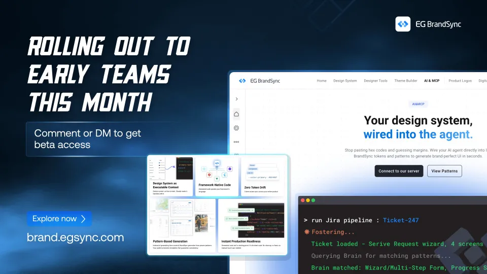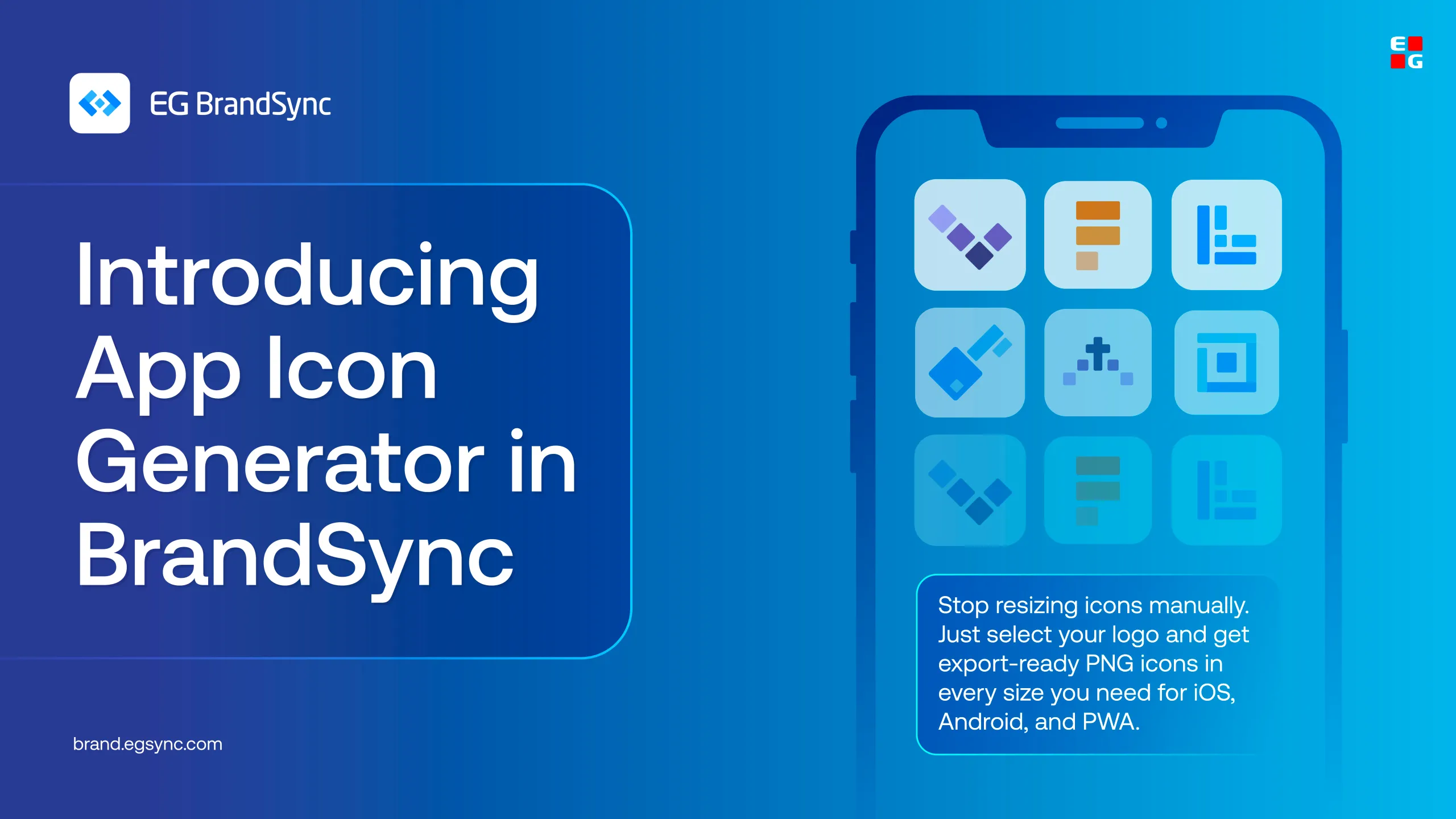
Over the past few months, it has been amazing to see how quickly BrandSync has grown across EG. What started as a shared space for design assets is now becoming a platform that teams across business units actively use to create, collaborate, and stay aligned.
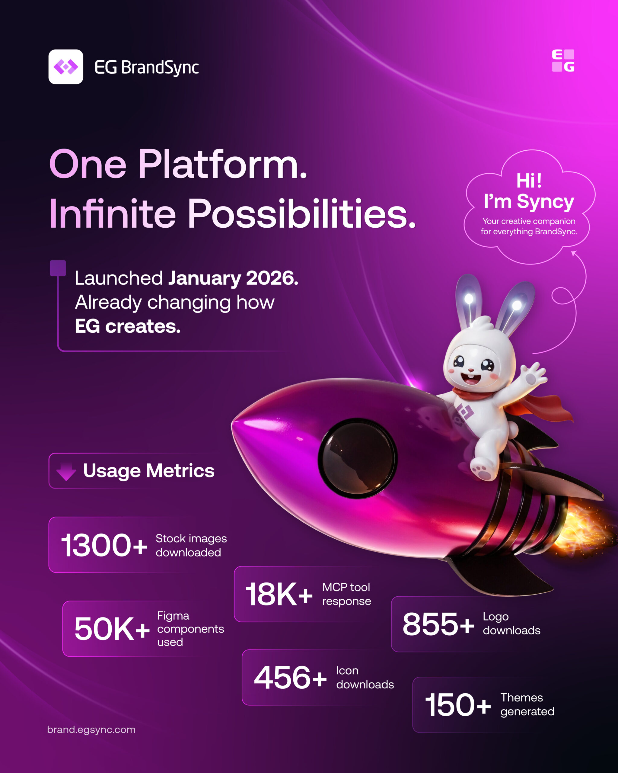
Since launching in January 2026, BrandSync has brought together Figma kits, product logos, brand guidelines, icons, stock assets, MCP and much more into one shared ecosystem.
And the adoption so far has been incredible: Here are some numbers:
• 1300+ stock images downloaded • 50K+ Figma components used • 18K+ MCP tool responses • 855+ logo downloads • 456+ icon downloads • 150+ themes generated
What excites us most is seeing teams use BrandSync in their daily workflows to move faster, stay consistent, and spend less time rebuilding or searching for assets.
A huge thank you to everyone across EG who has contributed, tested features, shared feedback, uploaded assets, and helped shape the platform along the way. We are only getting started.
And finally, meet Syncy. Our very happy BrandSync mascot. Expect to see a lot more of him in future posts alongside the rest of the BrandSync journey.